Branding · 7 min read
Brand identity examples: 12 real projects and what makes each one work in 2027
The best way to understand brand identity is to see it at work. Here are 12 real projects across fintech, real estate, food, coffee, construction and luxury, and the one lesson behind each that you can use for your own brand.

Jakaria MahmudBrand strategist and brand identity designer ·
A brand identity is the full visual and verbal system a business uses to be recognised: logo, colours, typography, imagery, graphic elements and tone of voice, with rules that keep them consistent. The best brand identity examples share three things: a clear idea behind them, one or two assets nobody else in the category owns, and a system that works everywhere from an app icon to a billboard. Below are 12 real projects from my portfolio, grouped by industry, with the lesson behind each one.
I am Jakaria Mahmud, a brand identity designer. These are client projects I designed, so I can explain the thinking, not just the look. Together they come from a body of work with 80+ clients across 12 countries, rated 5.0 on Google from 6 reviews.
Short answer. Good brand identity examples are built on a clear idea, own at least one distinctive asset (a symbol, a colour or a shape), and stay consistent across every touchpoint. Use the examples below for the lesson behind each one, not to copy the look.
What to look for in a brand identity example
- An idea you can say in one sentence. If nobody can explain why the logo looks the way it does, it will not guide future design.
- A distinctive asset. A symbol, colour, pattern or type style that competitors do not use.
- A system, not a logo. Colours, type, layouts and rules that make every new design look related.
- Proof on real touchpoints. Packaging, signage, app screens and social posts, not just a logo on a white page.
For the full definition, read what brand identity is and logo vs brand identity.
Fintech and technology brand identity examples
1. OneClick: trust in one glance
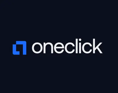
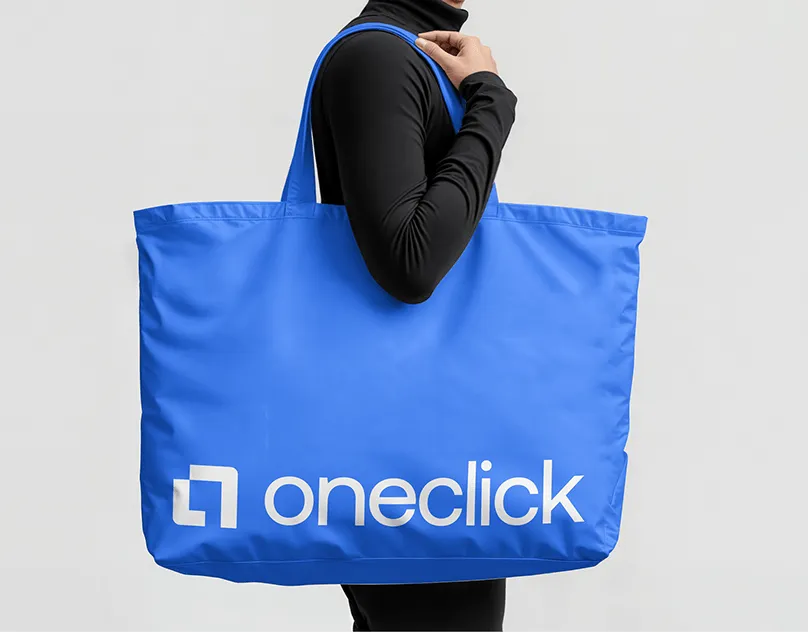
OneClick is a payment solution built to make digital transactions faster and more secure. The identity is clean and restrained on purpose, because in payments the first job is to look safe. Lesson: in regulated categories, clarity beats cleverness. See the OneClick case study.
2. MYPA: simple, smart, human
MYPA is a fintech brand designed to make financial experiences feel simpler and more trustworthy. Lesson: a friendly system can sit next to a serious product if the rules are tight. See the MYPA case study, and read about fintech branding.
3. SiteCove: fast, secure, reliable
SiteCove is a web hosting and website management company. The identity says fast, secure and reliable without stock server imagery. Lesson: show the benefit, not the hardware. See the SiteCove case study.
Real estate and property brand identity examples
4. ZREX: one mark on every screen
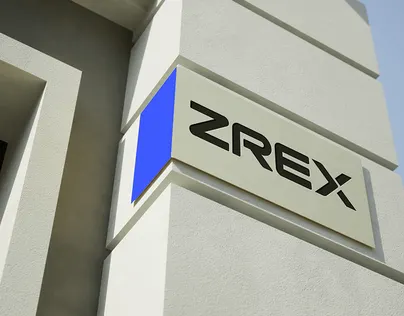
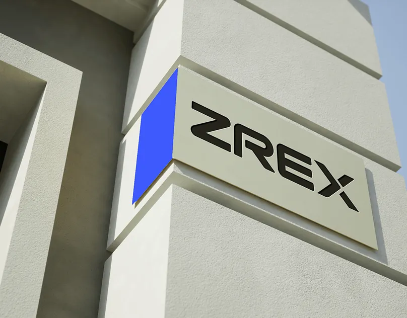
ZREX is a modern real estate platform. I built the identity around an arrow inspired mark and a Spectrum Blue palette that works from the app icon to signage. Lesson: design the symbol for the smallest size first. See the ZREX case study, and read about real estate branding.
Food, coffee and hospitality brand identity examples
5. NOMAD Coffee: a can you remember
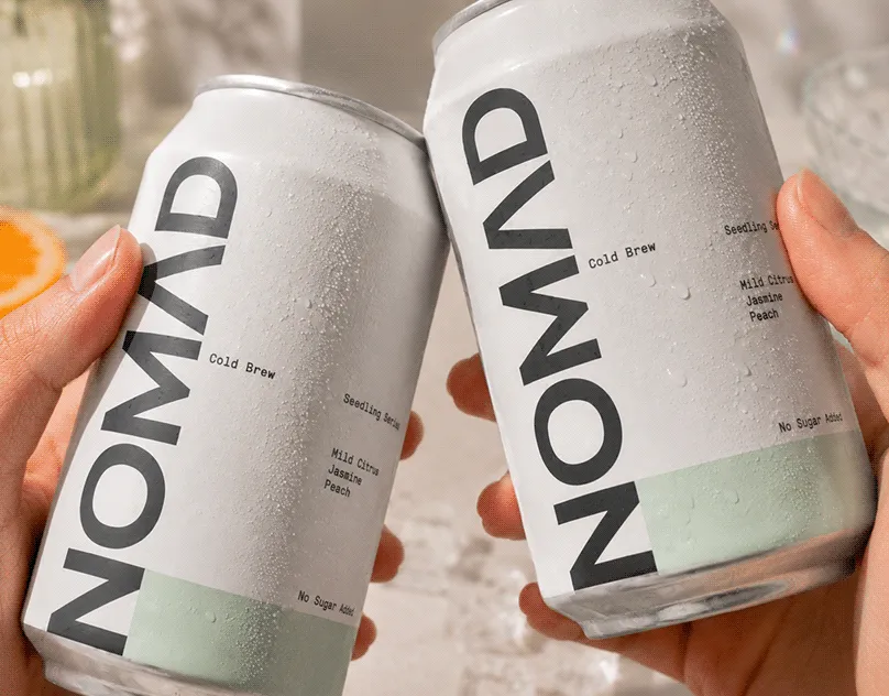
NOMAD is a premium cold brew brand. The identity and the can packaging were designed together, from strategy to retail and billboards. Lesson: when the pack is the main touchpoint, design the identity on the pack, not on a white page. See the NOMAD case study.
6. OCHO Coffee Co.: warm and authentic
OCHO is a modern coffee brand with a warm identity carried from cups to storefront. Lesson: consistency across small items, cups, bags and sleeves, builds recognition faster than one big campaign. See the OCHO case study.
7. CLOGA: a brand built around sharing
CLOGA is a restaurant and wine bar. I designed a wordmark, a face and fish line symbol and a sage green system for menus and signage. Lesson: a symbol that tells the concept's story gives staff and customers something to talk about. See the CLOGA case study, and read about restaurant branding.
8. Mr. Branky's: personality you can taste
Mr. Branky's is a smash burger brand with a script wordmark, a burger mascot and a red and cream system for menus, bags, cups and a loyalty card. Lesson: in a crowded street food category, personality is the differentiator. See the Mr. Branky's case study.
Construction, logistics and energy brand identity examples
9. INGLIS Contractors: dependable at scale
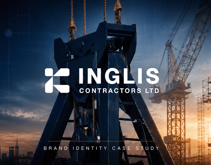
INGLIS delivers essential infrastructure across the UK. The identity is bold and dependable and has to work on vehicles, site hoardings and safety documents. Lesson: B2B brands are judged on reliability, so the system must survive harsh, practical use. See the INGLIS case study, and read about construction company brand identity.
10. MasBriX: speed you can see
MasBriX is a logistics brand. The identity stands for speed, reliability and trust and was designed for vehicle graphics from the start. Lesson: test the identity on the touchpoint people see most, here a moving truck. See the MasBriX case study.
11. ORVEA: optimistic clean energy
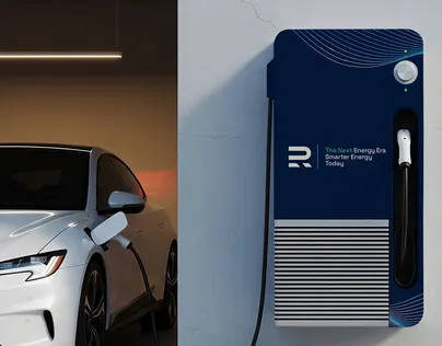
ORVEA is a solar technology brand built around clean energy and a green, optimistic look. Lesson: sustainability brands need proof and restraint, not just green. See the ORVEA case study.
Luxury brand identity example
12. Goldmark: quiet confidence
Goldmark is a premium brand with a modern luxury look, from logo and strategy to packaging and guidelines. Lesson: luxury is mostly about what you leave out: fewer colours, more space, better materials. See the Goldmark case study, and read about luxury branding.
What the best brand identity examples have in common
| Pattern | Example | How to apply it |
|---|---|---|
| Designed for the main touchpoint | NOMAD (can), MasBriX (truck) | List where buyers meet you most and design there first |
| One owned asset | ZREX arrow, CLOGA symbol | Pick one symbol, colour or shape nobody in your category uses |
| Fit with the category's job | OneClick (trust), Mr. Branky's (fun) | Ask what the buyer needs to feel before they buy |
| Rules that keep it consistent | Goldmark, INGLIS | Write brand guidelines before rollout |
Brand identity in 2027: what changes
In 2027 a brand identity is seen less often on paper and more often as a small icon, in a search result or inside an AI answer. That favours simple symbols, strong colour and clear names, and it rewards brands that describe themselves the same way everywhere, because AI assistants and Google read those descriptions. See the branding trends for 2027 and the logo design trends for 2027.
How to build your own strong brand identity
- Write a one page positioning brief: who it is for, why you are different. See brand positioning statement.
- Map competitors and choose one asset nobody owns.
- Design the logo and system on your real touchpoints, at their real sizes.
- Document the rules in guidelines and hand over every file.
- Check the name and logo are free to use and protect them; see how to trademark a logo.
The full method is in the brand identity design process, and the common traps are in brand identity mistakes to avoid.
How I can help
I design brand identities for startups and growing companies, starting from strategy and ending with guidelines and files you own. See more work in the brand identity portfolio. The Launch plan is $799 one time for a positioning brief, logo, brand starter kit and one landing page. The Partner plan is $1,999 per month for full strategy, identity, guidelines and website. The Growth plan is $3,999 per month and adds sales systems, lead generation and advanced SEO. See the full plans.
Opening a restaurant or cafe? Read restaurant branding in 2027.
Building a fitness or wellness brand? Read fitness and wellness branding in 2027.
More brand identity work: WeMake, R-Load and Le Bouket.
The takeaway
Every strong example above started with a clear idea and one owned asset, and was designed on the touchpoints that matter for that business. Copy the thinking, not the look, and your identity will be just as recognisable in its own category.
Browse recent work, read my client reviews, or book a free 30 minute call.
Frequently asked questions
A good brand identity example has a clear idea behind it, at least one distinctive asset such as a symbol or colour, and a consistent system across every touchpoint. ZREX, for example, uses an arrow inspired mark and a Spectrum Blue palette that work from the app icon to signage.
Logo, colour palette, typography, imagery, graphic elements and tone of voice, plus brand guidelines that explain how to use them consistently.
A logo is one element. A brand identity is the whole system around it: colours, type, imagery, layouts, voice and rules, designed to make every touchpoint recognisable.
Start from a clear positioning, map what competitors look like, and own one asset nobody else in your category uses. Then design on your real touchpoints and keep it consistent with written guidelines.
The brand identity portfolio on jakaria.design shows full case studies across fintech, real estate, food, construction, logistics, energy and luxury, with the logo, system and real applications for each.
Yes. I design brand identities for startups and growing companies in the USA, UK, Australia, Norway and worldwide, from strategy to guidelines and files you own. 80+ clients across 12 countries, rated 5.0 on Google from 6 reviews.