Abstract mark
An abstract mark is a logo symbol made of geometric or organic shapes that do not picture a real object, such as a swoosh or a set of bars. It can mean anything, so the brand has to give it meaning over time. Read more: Types of logos.
Glossary · 51 terms · Plain English
The words designers use, explained in one or two sentences each. Written by Jakaria Mahmud, a brand identity designer, so founders and teams can brief, review and buy design with confidence. Each term links to the guide that covers it in depth.
At a glance
This glossary defines 51 brand design terms in plain English, from abstract mark to wordmark. The three that matter most: a brand is what people expect and feel about a company; a brand identity is the logo, colour, type, imagery and voice that express it; and brand guidelines are the rules for using that identity consistently.
A to Z
Jump to a letter, or use your browser’s find to search a term.
An abstract mark is a logo symbol made of geometric or organic shapes that do not picture a real object, such as a swoosh or a set of bars. It can mean anything, so the brand has to give it meaning over time. Read more: Types of logos.
A brand is what people expect, feel and say about a company, built from every experience they have with it. Design shapes the brand but does not own it: the product, service and reputation count as much as the logo. Read more: What is brand identity.
A brand archetype is one of twelve character types, such as the Hero, the Sage or the Rebel, used to give a brand a consistent personality. It is a shortcut for tone and imagery, not a replacement for positioning. Read more: Brand archetypes.
Brand architecture is how a company organises its brands, sub brands and products. The main models are a branded house (one master brand), a house of brands (separate brands) and endorsed brands (separate names backed by the parent).
Also called: distinctive brand asset
A brand asset is any element people recognise as yours without seeing the name, such as a colour, shape, pattern, character, sound or slogan. Strong brands protect a few assets and use them every time.
A brand audit is a structured review of how a brand looks, sounds and performs today across every touchpoint, compared with competitors and with what customers actually think. It shows what to keep, fix or drop before a rebrand. Read more: Brand audit checklist.
Brand equity is the commercial value a brand adds beyond the product itself. It shows up when people choose you faster, pay more, stay longer and forgive a mistake. Read more: How branding increases sales.
Also called: BX
Brand experience is the sum of what it feels like to discover, buy and use a brand, from the website and packaging to onboarding and support. It is where the brand promise is kept or broken. Read more: Brand experience trends 2027.
Also called: brand book, brand style guide
Brand guidelines are the rules for using a brand: logo use and misuse, colour codes, typography, imagery, tone of voice and examples. They let anyone produce on brand work without asking the designer every time. Read more: Brand guidelines design, Free brand guidelines template.
Brand identity is the visible and verbal system a company uses to express its brand: the logo, colour palette, typography, imagery, graphic elements and tone of voice, applied consistently. A logo is one part of it. Read more: Brand identity design, Logo vs brand identity.
Brand personality is the set of human traits a brand shows, such as warm, precise or bold. It guides the tone of voice, imagery and design choices so the brand feels like the same person everywhere. Read more: Brand voice.
Brand positioning is the place a brand chooses to own in the buyer’s mind: who it is for, what problem it solves and why it is the better choice than the alternatives. Good design starts from it. Read more: Brand strategy.
A brand promise is the one thing customers can always expect from a brand, stated simply. It only works if the product and service deliver it every time.
A brand refresh modernises how a brand looks without changing its name, positioning or core idea. It usually means a tidier logo, updated colours and type, and new templates. Read more: Rebranding services, What a rebrand costs.
Brand strategy is the plan for how a brand will win: target audience, positioning, value proposition, messaging and personality. It turns business goals into clear decisions the identity can express. Read more: Brand strategy, What a brand strategist does.
Brand storytelling is the use of a clear story, with a customer, a problem and a better outcome, to explain why a brand exists and why it matters. The customer is the hero; the brand is the guide. Read more: Brand storytelling.
A brand touchpoint is any place a person meets the brand: an ad, the website, a search result, packaging, an invoice, a sales call or a support email. Consistency across touchpoints builds recognition.
Also called: tone of voice
Brand voice is the consistent personality in how a brand writes and speaks. Tone of voice is how that voice adapts to the moment, for example friendlier in onboarding and more direct in an error message. Read more: Brand voice.
Also called: exclusion zone
Clear space is the empty area that must surround a logo so nothing crowds it. Brand guidelines usually define it with a unit taken from the logo itself, such as the height of one letter. Read more: Brand guidelines template.
CMYK stands for cyan, magenta, yellow and key (black), the four inks used in most printing. Brand colours need CMYK values for print because screen colours do not reproduce exactly on paper. Read more: How to choose brand colours.
Also called: color palette
A colour palette is the defined set of brand colours, usually primary, secondary and neutral, with HEX, RGB, CMYK and Pantone codes and rules for how much of each to use. Read more: How to choose brand colours.
A combination mark is a logo that pairs a symbol with a wordmark, so the two can be used together or apart. It is the most flexible logo type for a growing business. Read more: Types of logos.
Also called: creative brief
A design brief is the written document that sets the goals, audience, scope, budget, deadline and success measures for a design project before work starts. A clear brief is the cheapest way to avoid revisions. Read more: Logo design brief.
A design system is a library of reusable interface components, tokens and rules that keeps a digital product consistent. It is the digital extension of a brand identity. Read more: UI/UX design.
A dieline is the flat template that shows where a package is cut, folded and glued, with bleed and safe areas marked. Packaging artwork is built on it before printing. Read more: Packaging design.
An emblem is a logo where the name sits inside a shape such as a badge, crest or seal. It feels traditional and official but can be hard to read at small sizes. Read more: Types of logos.
A favicon is the small icon shown in browser tabs, bookmarks and search results, often 16 to 48 pixels. A logo needs a simplified version that still reads at that size. Read more: Logo file formats.
Font pairing is choosing two typefaces that work together, usually one for headlines and one for body text, with enough contrast to create hierarchy and enough harmony to feel like one brand. Read more: How to choose brand fonts.
A HEX code is a six character code, such as #191919, that defines a colour on screens. Brand guidelines list it next to RGB, CMYK and Pantone values.
Also called: monogram
A lettermark is a logo made only of a brand’s initials, such as two or three letters drawn as one shape. It suits long names but carries little meaning until the brand is known. Read more: Types of logos.
A logo is the graphic mark that identifies a brand, made of a symbol, a wordmark or both. It works as a signature, not a description, and should stay clear from a favicon to a billboard. Read more: Logo design, How to design a logo.
A logo lockup is a fixed arrangement of the logo’s parts, such as the symbol beside or above the wordmark, or the logo with a tagline. Guidelines show which lockups to use where.
Also called: responsive logo
Logo variations are the approved versions of a logo for different spaces: primary, horizontal, stacked, icon only and one colour. Together they keep the brand readable at every size. Read more: Logo file formats.
A mascot is an illustrated character that represents a brand. It builds warmth and recognition, especially for consumer and family brands, but needs rules to stay consistent. Read more: Types of logos.
Minimum size is the smallest width at which a logo may be used before it stops being readable, defined in pixels for screens and millimetres for print. Read more: Brand guidelines template.
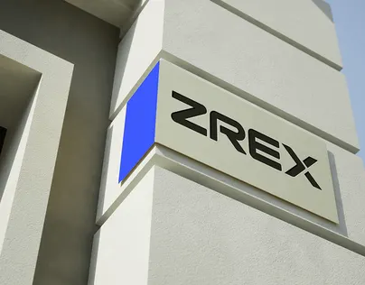
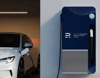
A mockup is a realistic preview of a design applied to a product, such as a logo on a sign or a label on a bottle. It helps judge the design in context before anything is produced.
A mood board is a collage of images, colours, type and textures that sets the visual direction for a project before design begins, so client and designer agree on the feel early. Read more: Brand identity design process.
Naming is the process of creating and checking a brand or product name: generating options, testing them with buyers, and checking trademarks, domains and social handles. Read more: How to name a brand.
Also called: PMS
Pantone is a standard colour matching system used by printers and manufacturers. A Pantone number, such as a PMS spot colour, makes a brand colour look the same across suppliers. Read more: How to choose brand colours.
Also called: logo symbol
A pictorial mark is a logo symbol based on a recognisable object, such as an apple or a bird. It is memorable but takes time and spend before it works without the name. Read more: Types of logos.
A positioning statement is an internal sentence that defines the target customer, the category, the main benefit and the proof. It keeps strategy, copy and design pointing the same way. Read more: Brand positioning statement.
Also called: rebranding
A rebrand changes a brand’s strategy and identity, and sometimes its name, to reflect a new direction, market or audience. It goes deeper than a refresh and needs a rollout plan. Read more: Rebranding services, Rebranding guide.
RGB stands for red, green and blue, the light based colour model used on screens. Brand guidelines give RGB values for digital use alongside HEX codes.
SVG (Scalable Vector Graphics) is a vector file format for the web. An SVG logo stays sharp at any size and is usually smaller than a PNG. Read more: Logo file formats.
Also called: slogan
A tagline is a short line that sits with the logo and sums up the brand’s promise or positioning. A slogan is often tied to one campaign; a tagline lasts longer.
A trademark is a legally protected sign, such as a name or logo, that identifies the source of goods or services. It is registered with an office such as the USPTO in the USA or the UKIPO in the UK; check it before you launch. Read more: How to name a brand.
Also called: font
A typeface is a design for letters, such as Helvetica; a font is one specific weight or style of it, such as Helvetica Bold. Brands usually define one or two typefaces and the weights they use. Read more: How to choose brand fonts, Typography trends 2027.
A value proposition is a clear statement of the benefit a customer gets, the problem it solves and why it beats the alternatives. It is the core of brand messaging. Read more: Brand strategy.
A vector file stores a design as mathematical paths instead of pixels, so it scales to any size without blur. Logos should be supplied as vector files such as AI, EPS, SVG or PDF. Read more: Logo file formats.
Visual identity is the visual part of a brand identity: logo, colour, typography, imagery, icons, patterns and layout. Brand identity also includes the verbal side, such as name and voice. Read more: Brand identity design.
Also called: logotype
A wordmark is a logo made of the brand name set in distinctive type, with no separate symbol. It builds name recognition quickly and works well for short, unique names. Read more: Types of logos, Logo design.
Keep reading
The work, the process and the guides behind it, so you can check everything before you get in touch.
A logo is the mark that identifies a brand. A brand identity is the whole system: logo, colour palette, typography, imagery, graphic elements and tone of voice, with rules for using them. See logo vs brand identity.
A brand is what people think and feel about a company. A brand identity is the set of visual and verbal tools the company uses to shape that perception.
A refresh updates how a brand looks without changing its name or positioning. A rebrand changes the strategy and identity, and sometimes the name.
Vector files (SVG, AI or EPS, and PDF) for scaling and print, PNG files for everyday digital use, and versions in full colour, one colour, black and white. See logo file formats.
Logo use and misuse, clear space and minimum size, colour codes (HEX, RGB, CMYK, Pantone), typography, imagery, tone of voice and real examples. Download the free brand guidelines template.
Jakaria Mahmud, a brand identity designer and brand strategist who has worked with 80+ clients across 12 countries. Definitions are written in plain English and reviewed as the site is updated.
Keep exploring
37 brand identity case studies, from fintech to construction.
Next step
Thirty minutes on your business, your customers and the first brand change I would make. You keep the advice whether you hire me or not.