Logo Design · 9 min read
How to fix an AI generated logo: turn it into a clean vector you can actually use and own
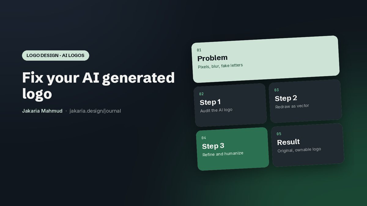
AI tools can give you a logo idea in seconds, but the file is usually a blurry raster with broken letters and uneven shapes, and it may not be fully yours. Here is how to turn an AI generated logo into a clean vector, fix its typical problems, make it look designed by a person, and protect it.

Jakaria MahmudBrand strategist and brand identity designer ·
Thousands of founders now start their logo in ChatGPT, Midjourney, Gemini or a logo generator. That is a sensible way to explore ideas quickly. The problem shows up later: the printer asks for a vector file, the letters look strange up close, the icon turns into a blur at favicon size, and a lawyer asks whether you can register it as a trade mark.
I am Jakaria Mahmud, a logo designer and brand identity designer working with startups and growing companies in the USA, UK, the Gulf and Europe. More and more clients now bring me an AI concept they like and ask me to make it real. This guide explains what is usually wrong with an AI logo, how to convert it to a proper vector, how to refine and humanize it, and what the law currently says about owning it.
Short answer. To fix an AI generated logo, treat it as a sketch, not a final file. Redraw it by hand as a vector (SVG, AI, EPS, PDF) instead of auto tracing it, correct the geometry and spacing, replace the AI lettering with a real or custom typeface, simplify it so it works at 16 pixels, and add enough human design decisions that it becomes original. That last step matters legally too: in the USA, a prompt alone is not authorship, but sufficiently creative human changes can be protected.
Why AI generated logos need fixing
Image models create pictures made of pixels. A logo is a system of precise shapes that must work everywhere, from a phone icon to a building sign. That gap causes the same problems again and again:
- It is a raster image, not a vector. PNG, JPG or WebP files go soft or pixelated when enlarged, and printers, sign makers and embroidery shops cannot use them.
- The letters are wrong. AI often invents letterforms: uneven stroke widths, odd joins, extra serifs or misspelled words. It is not a real font, so you cannot type it again.
- The geometry is uneven. Circles are not quite round, lines are not parallel and curves wobble. Up close it looks unfinished.
- Too much detail. Gradients, textures and tiny elements look nice at full size but disappear on a favicon, an app icon or a stamp.
- It looks generic. AI tends to produce the average of what it has seen, so many AI logos look alike and are hard to tell apart from competitors.
- Ownership is unclear. Purely machine generated work may not be protected by copyright, and a logo that is close to an existing mark can create trade mark risk.
How to convert an AI logo to vector
There are two ways to turn an AI logo into a vector file. They produce very different results.
| Method | How it works | Result | When to use it |
|---|---|---|---|
| Auto trace | Software such as Image Trace in Illustrator or an online vectorizer guesses the outlines | Hundreds of messy anchor points, bumpy curves, the same AI mistakes, now in vector form | Quick mockups or internal tests only |
| Manual redraw | A designer rebuilds every shape with clean bezier curves on a grid | Few, precise points, true geometry, crisp at any size, easy to edit | Any logo you will print, register or use for years |
If you want to try it yourself, here is the manual process I follow:
- Get the largest image you can. Upscale or regenerate at high resolution so the shapes are easier to read.
- Place it as a template. In Illustrator, Figma, Affinity Designer or Inkscape, lock it on a layer at low opacity.
- Set up a grid and guides. Decide on stroke widths, corner radii and circle sizes before you draw.
- Redraw with simple shapes first. Build from circles, rectangles and lines, then use the pen tool for curves with as few anchor points as possible.
- Rebuild the wordmark. Choose a licensed typeface that matches the feeling, then adjust spacing and customize letters by hand.
- Check it small and large. View it at 16, 32 and 64 pixels and on a large banner, in black and white as well as colour.
- Export the files. SVG and PDF for screens and print, AI or EPS for production, PNG for quick use, plus light, dark and one colour versions.
If you do not have the time or the tools, my AI logo vectorization and refinement service does exactly this, redrawn by hand rather than auto traced.
How to refine the design
Vectorizing fixes the file. Refining fixes the design. These are the changes that make the biggest difference:
- Optical balance: adjust shapes so they look even to the eye, not only on the grid. Round letters usually need to sit slightly above and below the line.
- Consistent strokes and corners: one stroke weight and one corner radius family make a mark feel deliberate.
- Kerning: fix the space between letters by hand. AI wordmarks almost always have uneven gaps.
- Simplify: remove gradients, shadows and details that do not survive at small sizes. Keep a separate simple icon if needed.
- Colour: pick a small palette with exact HEX, RGB and CMYK values and check contrast for accessibility.
- Lockups: create horizontal, stacked and icon only versions so the logo fits every format.
How to humanize an AI logo
A humanized logo is one where a person has made the decisions that matter, so it carries meaning, not just style. In practice that means:
- Start from the brand, not the picture. Write down who you serve, what you want to be known for and what feeling the brand should create. Then judge the AI idea against that.
- Add a detail with a reason. A custom letter, a cut, a shape from your product or story. One meaningful detail does more than ten decorative ones.
- Remove the AI look. Glossy 3D effects, random glows and over detailed illustrations are now easy to recognise as AI. Clean, flat and specific reads as designed.
- Make it distinctive. Compare it with your competitors' logos side by side. If you could swap them without anyone noticing, keep working.
This fits a wider shift. Among the branding trends for 2027, visibly human, crafted identity work is one of the strongest, because buyers have learned to spot generic AI output.
Can you copyright or trademark an AI logo?
I am not a lawyer, so please treat this as general information and speak to an intellectual property lawyer in your country before you file anything.
- Copyright in the USA: in its January 2025 report on copyrightability, the US Copyright Office said that prompts alone do not make you the author of the output and that simply selecting an output is not enough. It also said that where a human makes sufficiently creative modifications or arrangements, those human contributions can be protected.
- Trade marks are different: a trade mark protects a sign used in trade, not the creativity behind it. An AI made logo can in principle be registered, but it must be distinctive and must not be confusingly similar to an existing mark, which is a real risk with generic AI output.
- Tool terms: check the terms of the AI tool you used. Some limit commercial use on free plans.
The practical takeaway: the more real human design work goes into the final logo, and the more distinctive it is, the stronger your position. Before you invest in printing or a trade mark filing, run a trade mark search in each market you sell in.
Fix it yourself or hire a designer?
| Option | Typical cost | Good for | Watch out for |
|---|---|---|---|
| Online auto vectorizer | Free to low | Testing an idea | Messy curves, AI letters kept |
| Do it yourself | Your time plus software | Simple marks if you know a vector tool | Spacing and optical balance are hard to judge alone |
| Senior logo designer | From a few hundred dollars for vectorization to a few thousand for a full refinement and identity | A logo you will print, register and use for years | Choose someone who redraws by hand and gives you every file and full rights |
For a broader view of prices, read how much a logo costs. If your AI concept is not close to what you need, a fresh custom logo design can be faster than fixing it.
After the logo: make it a brand
A clean logo is the start. To use it consistently, you need colours, typography and a few rules for how it appears. That is your brand identity, and a short set of brand guidelines keeps your team, printers and developers using it the same way.
AI logo fix checklist
- Vector master files: SVG, PDF and AI or EPS
- No auto traced shapes left, only clean bezier curves
- Wordmark set in a licensed or custom typeface, spelled correctly
- Readable at 16 pixels and in one colour
- Horizontal, stacked and icon versions
- Colour values in HEX, RGB and CMYK
- Trade mark search done in your key markets
- Clear written transfer of rights from your designer
The takeaway
AI is a useful starting point for a logo, not the finish line. Redraw it by hand as a vector, refine the geometry and lettering, simplify it, and add the human decisions that make it yours. The result looks better, works everywhere and puts you in a stronger position to protect it.
Further reading: US Copyright Office: Copyright and Artificial Intelligence, including the January 2025 report on copyrightability.
Frequently asked questions
Treat it as a sketch. Redraw it by hand as a vector, correct the geometry and spacing, replace AI lettering with a real or custom typeface, simplify it so it works at small sizes and export SVG, PDF and AI or EPS files.
Place the image as a template in a vector tool such as Illustrator, Figma or Inkscape and redraw it with clean shapes and bezier curves. Auto trace is quick but keeps the AI mistakes and creates messy curves.
In the USA, the Copyright Office says prompts alone do not make you the author and selecting an output is not enough, but sufficiently creative human changes can be protected. Speak to an intellectual property lawyer for your case.
A trade mark protects a distinctive sign used in trade, so an AI made logo can in principle be registered if it is distinctive and not confusingly similar to an existing mark. Run a trade mark search first.
Because AI tools output raster images made of pixels. Enlarging them makes edges soft. A vector version made of mathematical shapes stays sharp at any size.
Online auto vectorizers are free or cheap but low quality. Hand redrawing by a senior designer usually starts at a few hundred dollars, and a full refinement with a small identity system costs more.
It means a designer makes the decisions that give the logo meaning and character: a distinctive detail, custom letters, balanced spacing and a simpler, more specific form that no longer looks generic.