Branding · 8 min read
Private equity branding in 2027: how investment firms build a brand that founders, investors and lenders trust
Founders choose a partner, investors choose a manager and lenders choose a counterparty. In each case the brand is the first proof of judgement. Here is how a private equity or investment firm builds a credible brand in 2027, what it costs and a real example.

Jakaria MahmudBrand strategist and brand identity designer ·
Private equity branding is how an investment firm shows founders, management teams, investors and advisers what it invests in, how it works and why it can be trusted with a company or with capital. In 2027 most of that judgement happens before the first meeting: on the website, on LinkedIn, in a deal announcement, in an AI answer and in the deck that lands in an inbox. A firm that looks generic, or like every other navy and gold fund, has to work much harder to prove it is different.
I am Jakaria Mahmud, a brand identity designer. I recently designed the identity for White Moss Capital, a UK private equity firm, and I have designed fintech and corporate brands including Wafra, OneClick and WeMake. This guide is the approach I use for investment and financial services firms.
Short answer. A private equity brand needs a clear investment thesis in plain words, a calm and ownable symbol, a serif and sans typography pair, a restrained palette, a voice that is confident without promising returns, and the same system across the website, pitch and reporting decks, LinkedIn and deal announcements. Expect about $5,000 to $15,000 for a boutique firm or first fund identity and $15,000 to $50,000 for an established firm with a full system, guidelines and templates in 2027.
Why private equity branding matters more in 2027
- Founders compare partners. A business owner selling or raising money talks to several firms. The brand is their first signal of how you think and how you will treat them.
- Capital is more selective. Investors and allocators meet many managers. A clear thesis and a credible presence make your firm easier to remember and easier to explain to a committee.
- Research starts online and in AI answers. People search a firm's name, read the website and ask AI assistants who invests in a sector. A consistent name, description and point of view across your site and profiles helps you get found and described correctly. See how to get recommended by AI search.
- LinkedIn is the new deal tombstone. Deal announcements, team news and market views are shared every week. A strong template system makes every post look like the same firm.
- Everyone looks the same. Navy, gold, a serif wordmark and a stock photo of a skyline. A distinctive idea is a real advantage.
Who this guide is for
- Private equity firms, from first time funds to established mid market firms
- Growth equity, venture capital and search funds
- Family offices and holding companies that invest directly
- Turnaround, special situations and credit investors
- Advisory, corporate finance and M&A boutiques
- Fintech and wealth platforms that need an institutional look. See fintech branding.
The 7 parts of a strong private equity brand
- A thesis in plain words. What you invest in, at what stage, in which markets and what you bring beyond capital. Write it so a founder understands it in one read. A positioning statement is the right tool.
- A name and story that hold up. Many firm names are surnames or places. If yours has a meaning, use it. White Moss Capital took its idea from Nordic reindeer lichen, a plant that survives harsh conditions.
- A calm, ownable symbol. A simple mark that works on a deck cover, a LinkedIn avatar, an app icon and a brass plaque. Avoid charts, arrows and lions unless they mean something specific.
- A serif and sans pair. A refined serif for headlines brings authority, and a clean sans for body text keeps reports and screens readable. See how to choose brand fonts.
- A restrained palette. One deep anchor colour, light neutrals and one or two quiet accents. Add a digital palette for charts and status colours so reports stay consistent. See how to choose brand colors.
- A voice that is confident, not promotional. Short, clear lines about partnership and approach work better than claims about returns.
- A template system. Website, investor and teaser decks, quarterly reports, LinkedIn posts, deal announcements, email signatures and stationery, all from one set of brand guidelines.
A real example: White Moss Capital
White Moss Capital is a UK based private equity firm that invests in retail and consumer businesses going through transformation, turnaround and complex situations across the UK, Benelux and the Nordics. The goal was a sophisticated, timeless and institutionally credible identity that communicates trust, clarity and confidence.
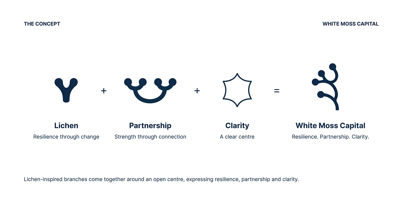
The symbol is inspired by Cladonia stellaris, known as reindeer lichen. Its branches come together around an open centre to express resilience, partnership and clarity. Newsreader, a refined serif, sets headlines and Inter sets body text. The palette is Deep Navy (#0E2A47), White, Frost Blue (#C8DCEB), Lichen (#DCE1D2) and Stone (#5F6B78), with a separate digital colour system for tints, neutrals and status colours.
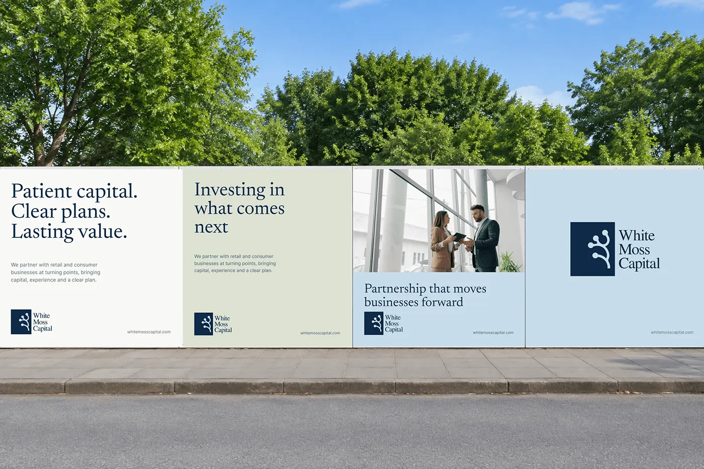
The same system runs across stationery, business cards in four colourways, brand guidelines, an app icon, the website, LinkedIn, office signage and outdoor campaigns such as "Investing in what comes next". Read the full White Moss Capital case study.
For a payments brand with the same need for trust, see the Wafra fintech brand identity, a bilingual Latin and Arabic system built for moving money across borders.
What private equity branding costs in 2027
- Logo and basic identity for a new fund or boutique: $5,000 to $15,000. Positioning, symbol and wordmark, colour, type, a short guide and core templates.
- Full brand system for an established firm: $15,000 to $50,000. Strategy, identity, full guidelines, deck and report templates, LinkedIn system, stationery and website design direction.
- Large or multi strategy firms: $50,000 and more, with research, naming, sub brands for funds and a full website build.
Website development, photography, printing and signage are usually extra. My own plans start at Launch, $799 one time, for a logo and starter kit, with Partner at $1,999 a month and Growth at $3,999 a month for ongoing design. Growth adds sales systems, lead generation and advanced SEO. See brand strategy and what a brand consultant costs.
Brand and compliance: say less, prove more
- Do not promise returns. Talk about how you work, what you look for and how you support management teams. Leave performance to your formal materials.
- Follow your regulator's marketing rules. Financial promotions are regulated in most markets. Ask your compliance team to review website copy, decks and campaigns.
- Show people and portfolio stories. Real team photos, clear bios and case stories approved by portfolio companies build more trust than stock imagery.
- Be consistent. The same name, description, logo and tone across the website, LinkedIn, Companies House or local registers and databases help people and AI tools describe you correctly.
Private equity brand launch checklist
- One sentence thesis that a founder understands
- Logo, symbol and wordmark in light and dark versions
- Serif and sans typography with licences sorted
- Brand palette plus a digital palette for charts and status colours
- Website with team, approach, portfolio and contact pages
- Investor, teaser and quarterly report templates
- LinkedIn banner, avatar and deal announcement templates
- Email signature, letterhead, business cards and envelopes
- Office sign and event materials
- Brand guidelines your team, advisers and portfolio companies can follow. Use this brand guidelines checklist.
Private equity branding mistakes to avoid
- Copying the big names. Navy, gold and a skyline say nothing about you.
- A thesis full of jargon. "Value creation through operational excellence" could be any firm. Say what you actually do.
- Charts and arrows as logos. They date quickly and read as a promise of growth.
- A beautiful logo with no templates. Most of a firm's brand lives in decks, reports and LinkedIn. Build those first.
- Ignoring small sizes. The symbol has to work as a LinkedIn avatar and a favicon, not only on a brochure cover.
Finance and corporate brands I designed: White Moss Capital, Wafra and WeMake.
The takeaway
In 2027 private equity and investment firms win trust with clarity and consistency. Put your thesis in plain words, choose one calm and meaningful symbol, pair a refined serif with a clean sans, keep the palette restrained and build templates for the places people actually meet your firm: the website, the deck, the report and LinkedIn. For more on brands that sell to businesses, read B2B branding and the fintech branding guide.
Building or refreshing an investment firm brand?
I design brand identities for private equity, investment, fintech and corporate firms in the UK, USA, Europe and worldwide, with fixed prices and every file yours. See brand identity design, brand strategy and brand consulting, then book a free 30 minute call.
Frequently asked questions
Private equity branding is the positioning, name, logo, typography, colours, voice and templates that make an investment firm clear, credible and recognisable to founders, management teams, investors and advisers.
Typical budgets are $5,000 to $15,000 for a boutique firm or first fund identity, $15,000 to $50,000 for an established firm with full guidelines and templates, and $50,000 or more for large or multi strategy firms. Website builds, photography and printing are usually extra.
A good private equity logo is calm, simple and meaningful. It works as a LinkedIn avatar, a deck cover and an office sign, and it avoids generic charts, arrows and lions. A clear story behind the symbol, like the lichen idea behind White Moss Capital, makes it memorable.
Most credible investment brands pair a refined serif for headlines with a clean sans for body text, and use one deep anchor colour with light neutrals and one or two quiet accents. The aim is authority and clarity, not decoration.
Be careful. Financial promotions are regulated in most markets, so brand copy should focus on approach, partnership and sector focus. Ask your compliance team to review website copy, decks and campaigns.
Yes. I designed the White Moss Capital private equity identity and fintech brands including Wafra, OneClick and MYPA, for clients in the UK, USA and worldwide. 80+ clients across 12 countries, rated 5.0 on Google from 6 reviews.