- Industry
- Fintech and cross border payments
- Year
- 2026
- Scope
- Brand strategy and visual direction, logo and logo variations, bilingual wordmark, symbol, colour palette, typography, brand guidelines
- Applications
- App promotion, website, social media, Instagram stories, payment cards, digital wallet, notifications, corporate stationery
- Client need
- A payments brand has to earn trust before anyone sends money.
- Outcome
- One consistent system, from the app to the payment card.
The problem
A payments brand has to earn trust before anyone sends money.
WAFra Workflow is a fintech focused company in the financial technology space, where efficiency, innovation and trust play an essential role.
The goal was a distinctive, contemporary identity that communicates professionalism, reliability and a forward thinking approach to financial technology, and works for people who read Latin and Arabic script.
The solution
A W symbol, a bilingual wordmark and calm olive tones.
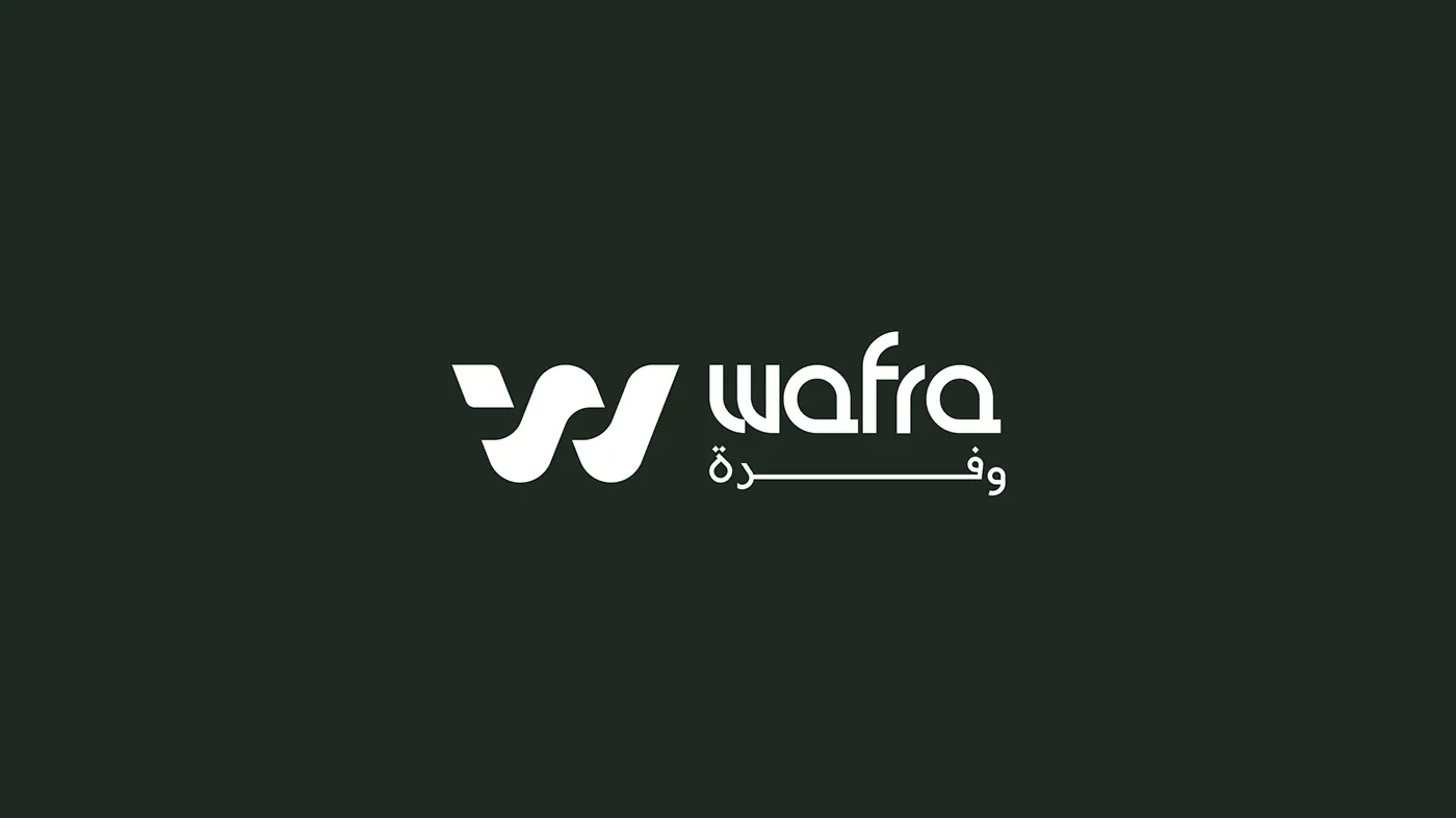
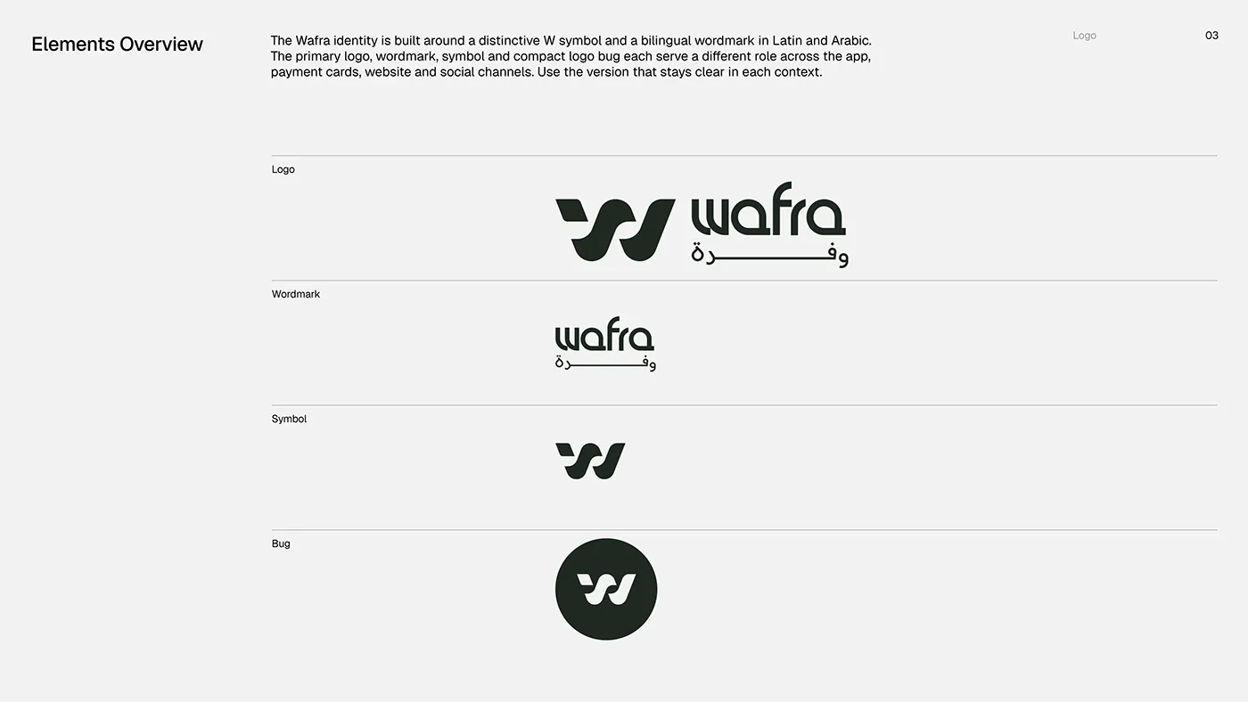
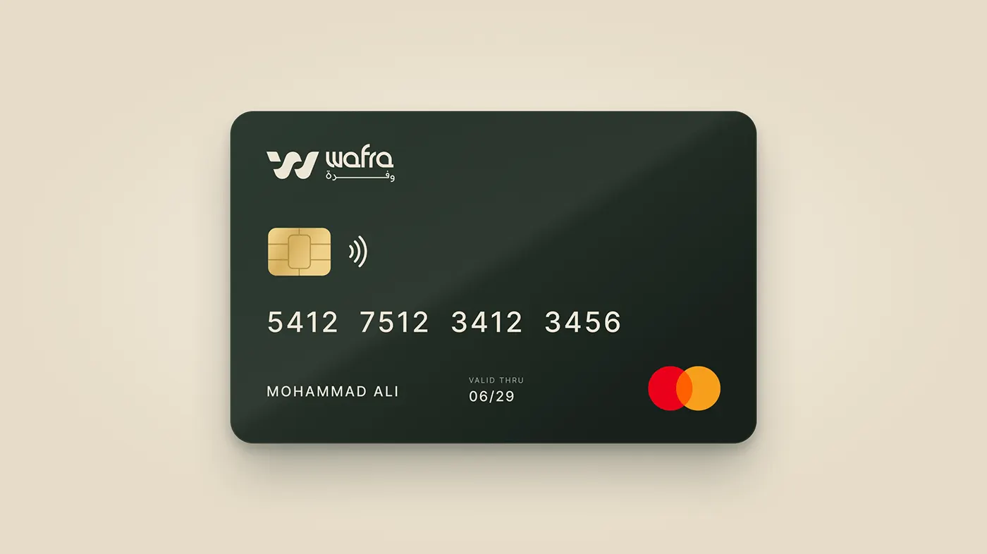
The identity is built around a distinctive W symbol and a bilingual wordmark in Latin and Arabic. The primary logo, wordmark, symbol and compact logo bug each have their own role across the app, payment cards, website and social channels.
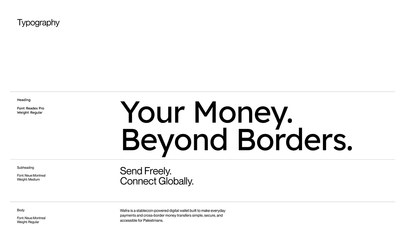
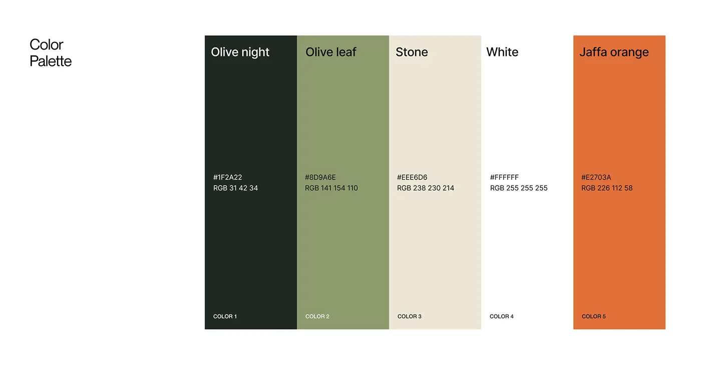
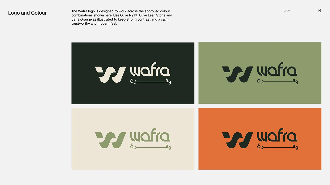
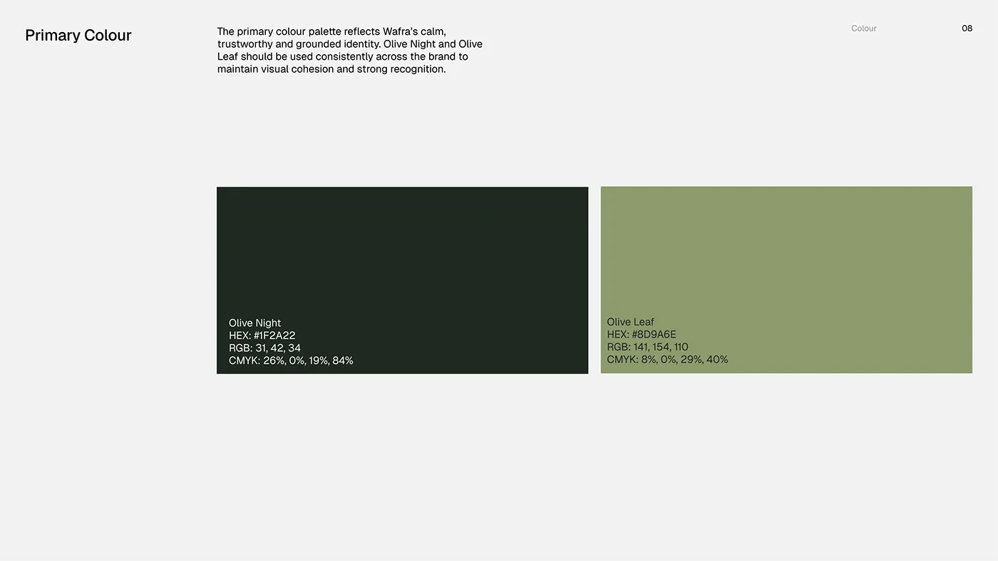
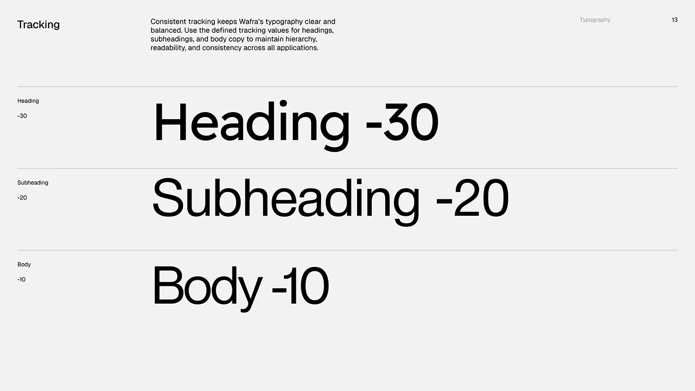
The palette pairs Olive Night (#1F2A22) and Olive Leaf (#8D9A6E) with Stone (#EEE6D6), White and a Jaffa Orange accent (#E2703A). Readex Pro sets headlines such as "Your Money. Beyond Borders." with set tracking for headings, subheadings and body text.
The result
One consistent system, from the app to the payment card.
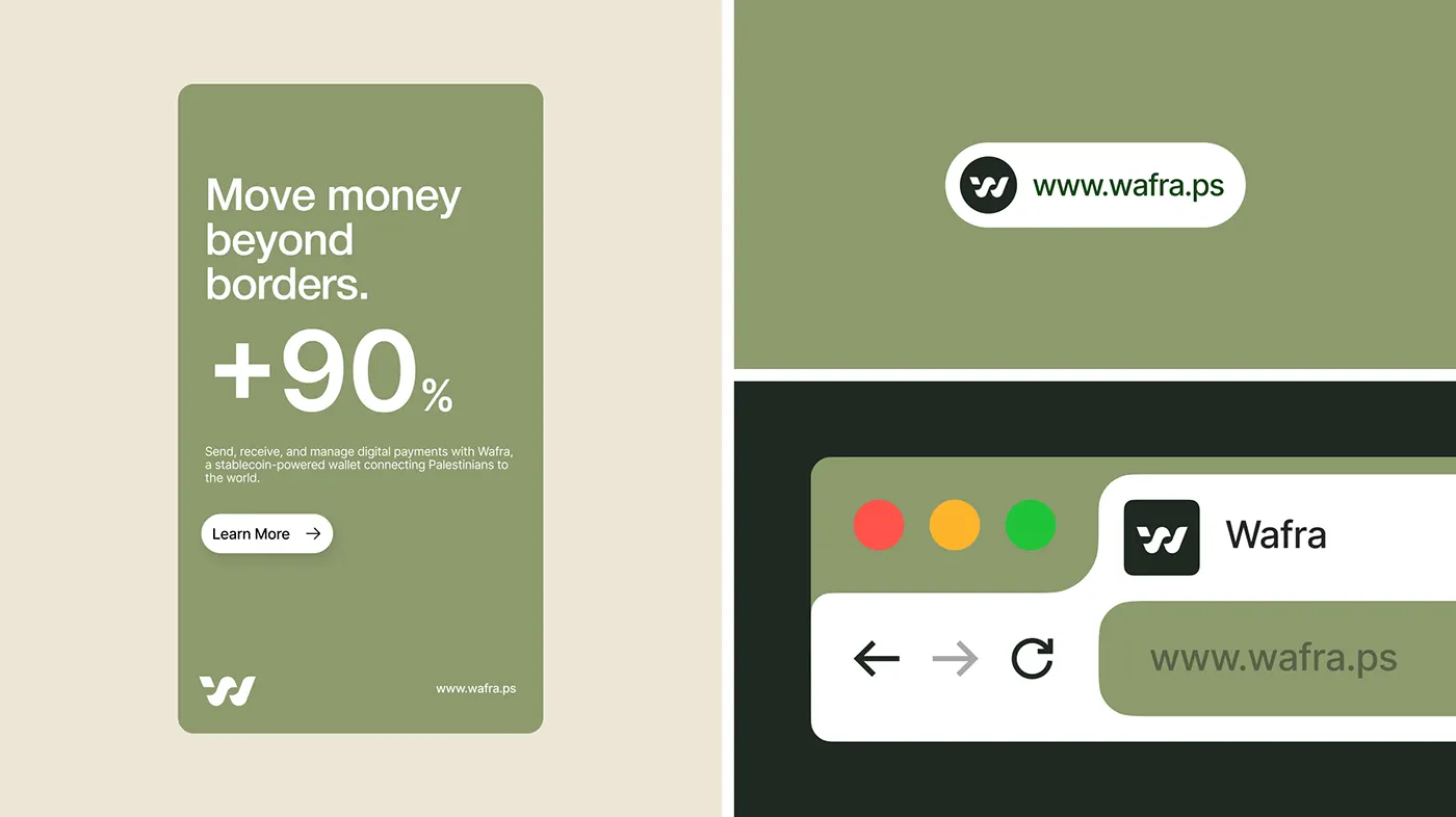
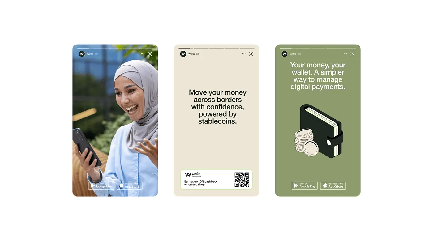
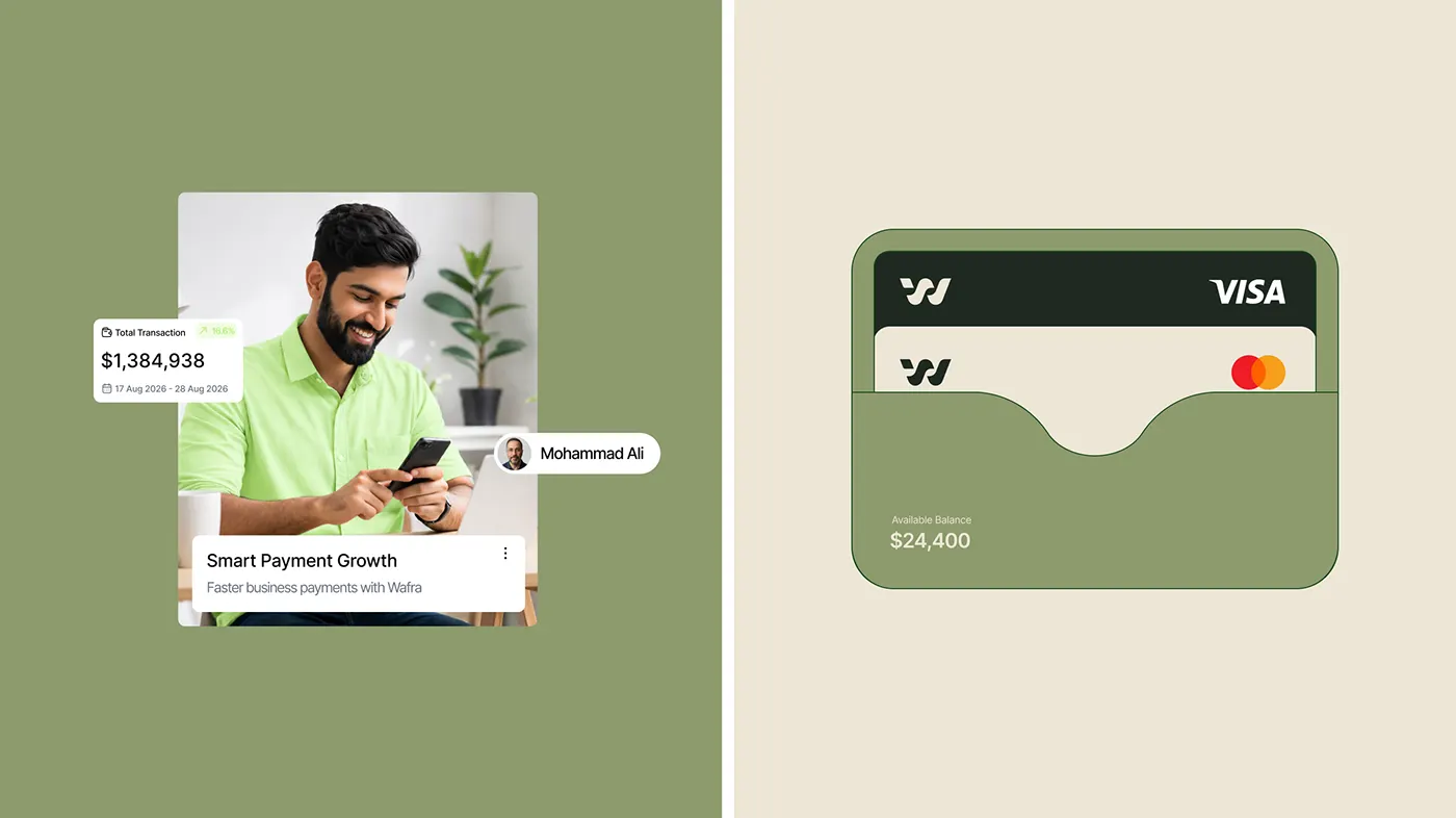
The system carries from app promotions such as "Move money beyond borders" and the wafra.ps website to Instagram stories about sending money across borders with confidence and a simpler digital wallet.
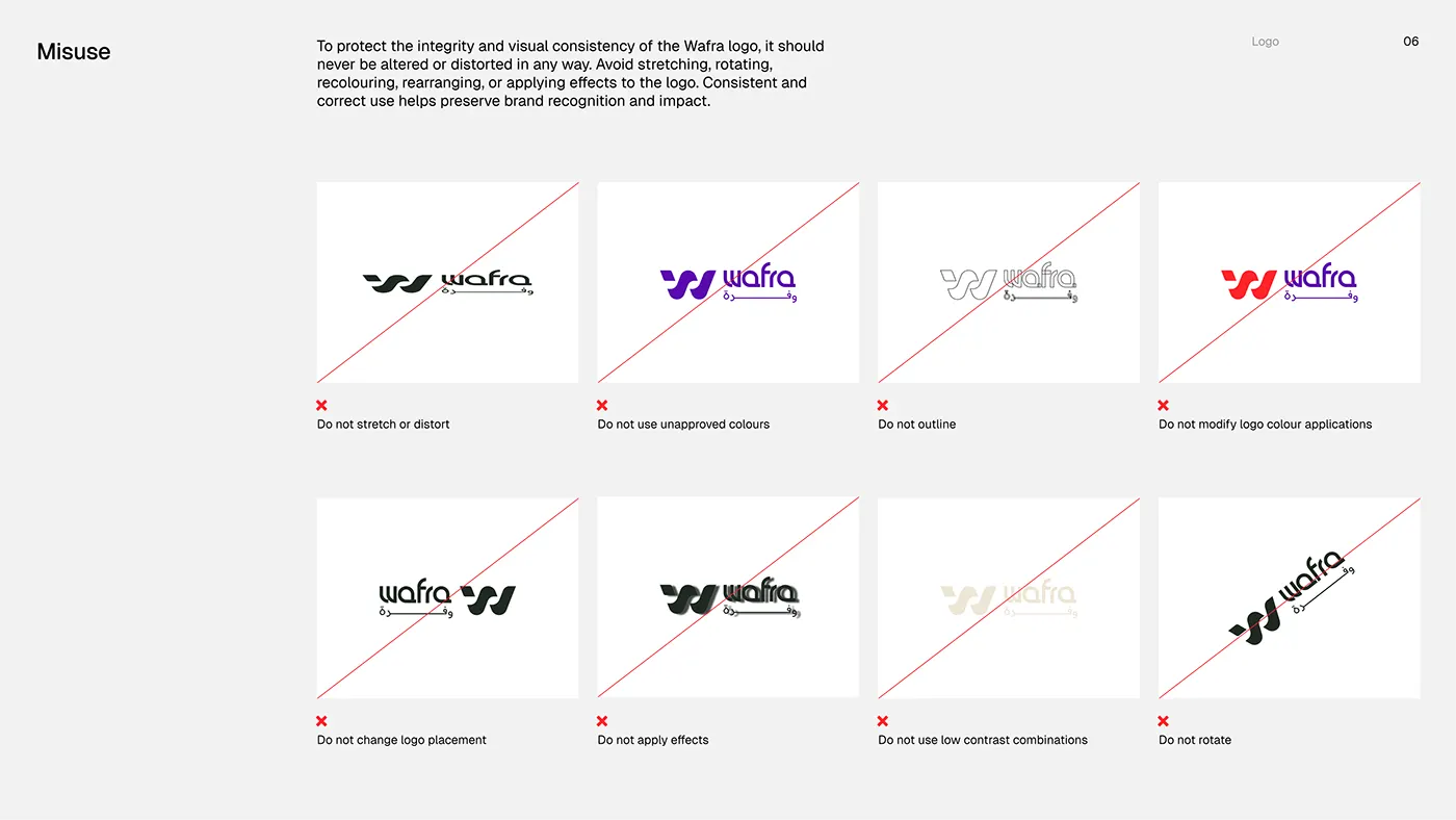
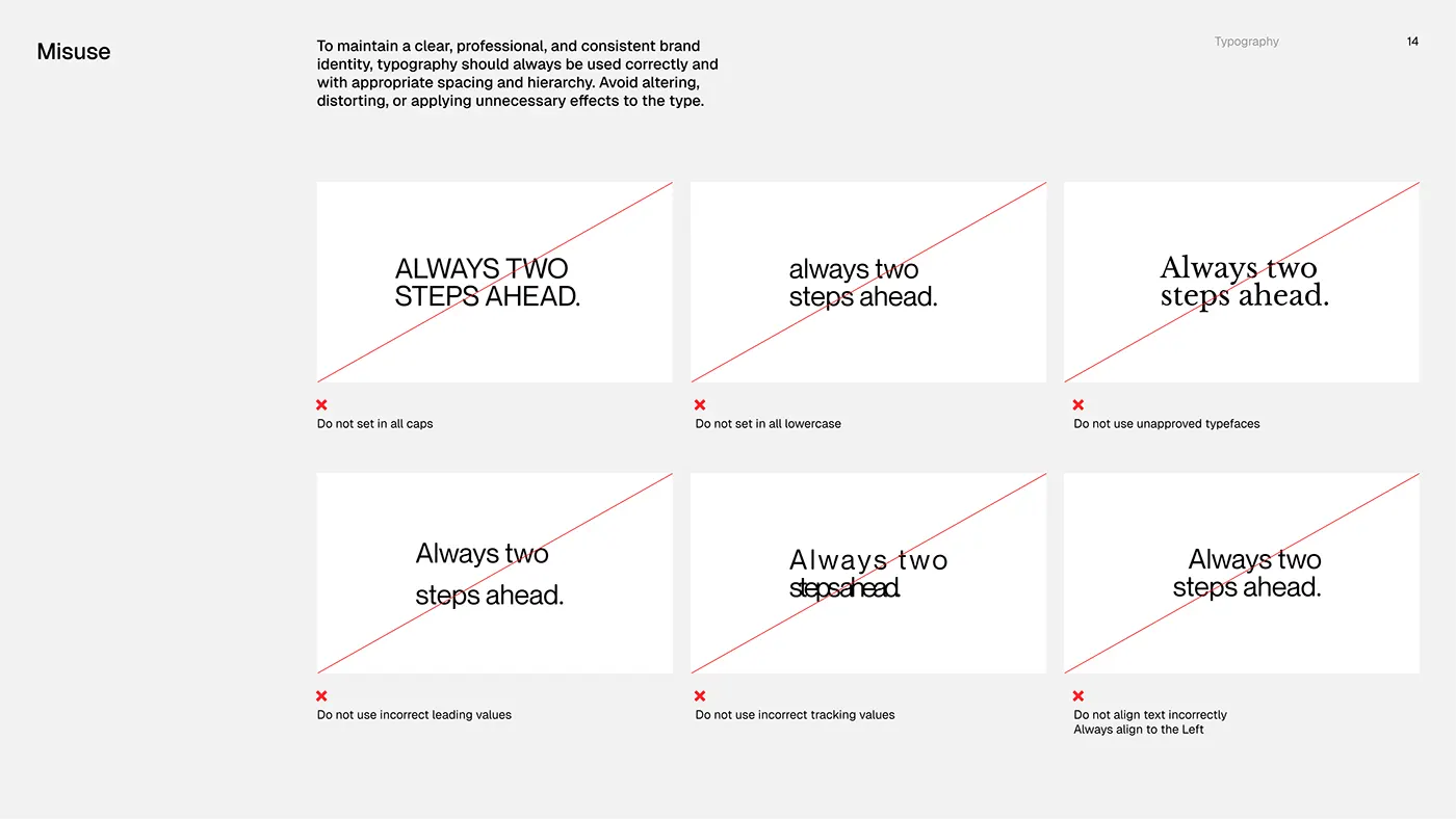
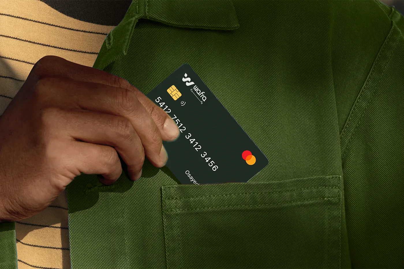
It also covers Visa and Mastercard payment cards, wallet and notification moments, and brand guidelines with minimum sizes, logo colour rules and clear misuse examples for the logo and type.

What I delivered
Brand strategy and direction
Visual direction for a modern, trustworthy fintech built around cross border payments.
Logo and variations
Primary logo, wordmark, W symbol and a compact logo bug for small spaces.
Bilingual wordmark
A Latin and Arabic wordmark that reads as one brand in both scripts.
Colour and typography
Olive Night, Olive Leaf, Stone, White and Jaffa Orange, with Readex Pro type.
Brand guidelines
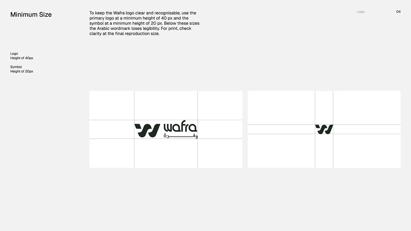
Minimum sizes, logo on colour, tracking rules and logo and type misuse.
Cards and digital
Payment cards, app promotion, website, social posts and stories.
Tools and credits
Designed by Jakaria Mahmud, brand identity designer and logo designer.
- Adobe Photoshop
- Adobe Illustrator
- Adobe InDesign
- Figma
The full project, with every board, is also published on Behance.
Fintech branding: what this project shows
Lessons for fintech and payments companies.
Wafra is a fintech and cross border payments project by Jakaria Mahmud, a senior brand identity designer working with clients in the USA, UK, Europe and Australia. The work covered brand strategy and visual direction, logo and logo variations, bilingual wordmark, symbol, colour palette, typography, brand guidelines.
Fintech brands have to feel safe enough to hold money and modern enough to switch to. The identity has to work as an app icon, on a card and inside the product, where most trust is won or lost.
What other fintech brands can take from it:
- One clear position before any visual decision
- A simple mark that reads at app icon size
- A colour system that stands apart from blue banks while still feeling secure
Read the fintech branding guide, see the fintech branding service, or how I work with clients in the USA, UK, Australia and Norway.
FAQ
How much does a brand identity like Wafra cost?
Projects start with the Launch plan at $799 one time, which covers the logo, a brand starter kit and one landing page. A full identity with guidelines, like this fintech and cross border payments project, runs on the Partner plan at $1,999 per month. Prices are fixed and public on the pricing page.
How long does a project like this take?
One to two weeks for a logo and starter kit, and three to five weeks for a full identity with guidelines and website.
Do I own the final files?
Yes. Once the project is paid in full, you get every file, the Figma source and full rights to the logo and identity.
Can you design a brand like this for my company?
Yes. I work with founders in the USA, UK, Europe, Australia and worldwide. Book a free 30 minute call and you get a clear plan and a fixed price for your scope.
What makes a strong fintech brand identity?
A strong fintech brand identity has one clear position, a simple logo that works as an app icon and on a card, a colour that stands out from traditional banks, plain language and visible proof of safety such as licences, security and reviews.
Who designed the Wafra brand identity?
Wafra was designed by Jakaria Mahmud, a senior brand identity designer and logo designer who works with startups and growing businesses in the USA, UK, Europe and Australia. The full project is published on jakaria.design and Behance.
Related topics 19
- Wafra brand identity
- Wafra logo design
- Fintech branding
- Payments brand identity
- Bilingual logo design
- Arabic logo design
- Fintech logo
- Brand guidelines
- Brand identity
- Fintech brand identity
- Fintech branding case study
- Fintech logo design
- Fintech brand designer
- Neobank branding
- App icon design
- Brand identity design
- Senior brand designer
- Brand identity designer USA
- Brand identity designer UK
More brand identity work
View all work OneClickFintech brand identity
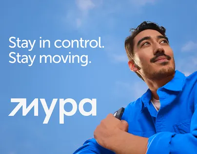 MYPAFintech brand identity
 White Moss CapitalPrivate equity brand identity
Next step
Start with a free brand audit.
Thirty minutes on what your brand is saying today, what it should say, and the order I would fix it in. You keep the plan whether you hire me or not.