- Industry
- Food and grocery delivery
- Year
- 2026
- Scope
- Wordmark, F symbol, colour palette, typography, patterns, brand guidelines
- Applications
- App icon, delivery app, stationery, social media, posters, delivery bags, food packaging, uniform, delivery van
- Client need
- A delivery brand has to feel quick and friendly on a phone.
- Outcome
- One brand, from the app to the delivery van.
The problem
A delivery brand has to feel quick and friendly on a phone.
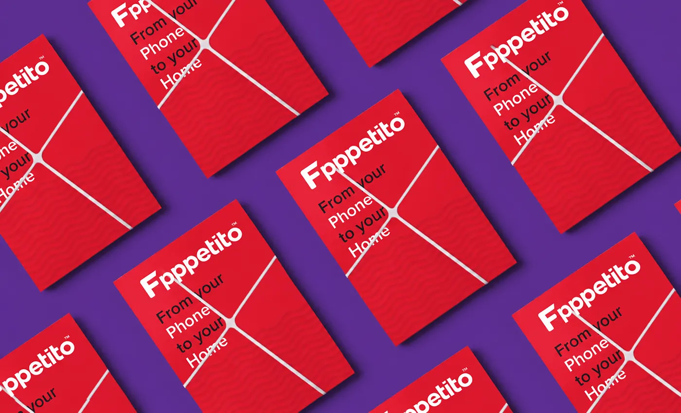
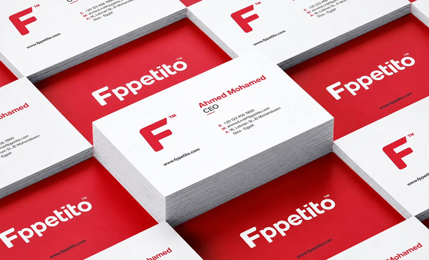
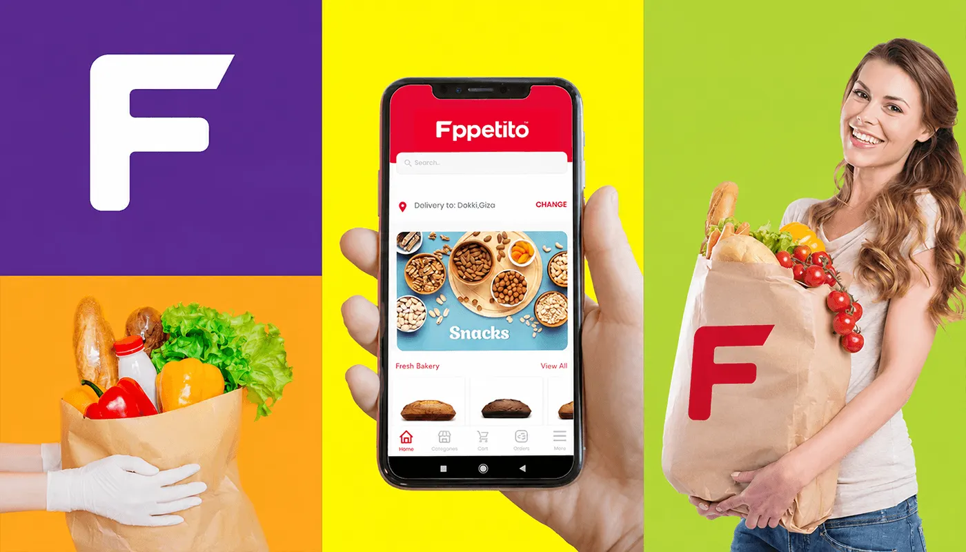
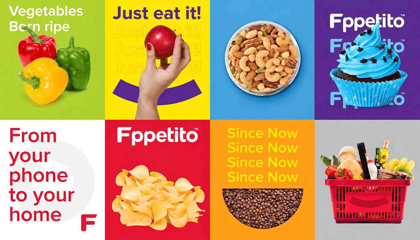
Fppetito delivers daily fresh baked products, nuts, groceries and a wide selection of savoury and sweet snacks, built around the promise "From your phone to your home."
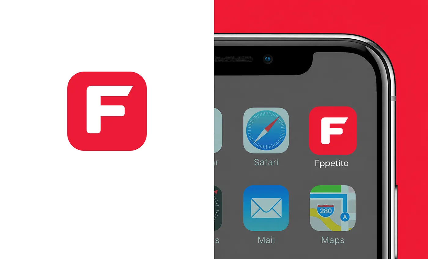
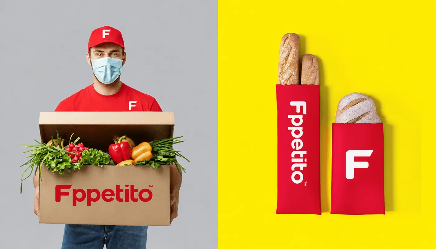
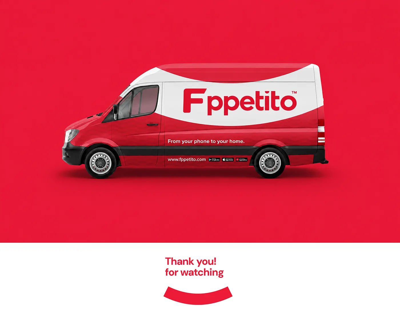
The identity had to work as a small app icon and on bags, boxes, uniforms and vans.
The solution
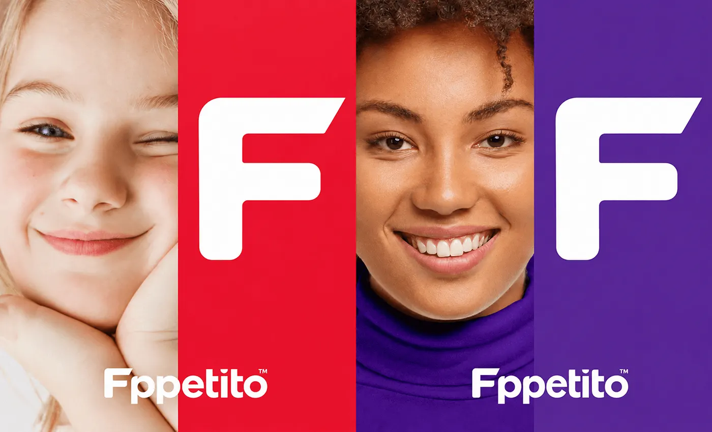
A bold wordmark, a smiling F and fresh colours.
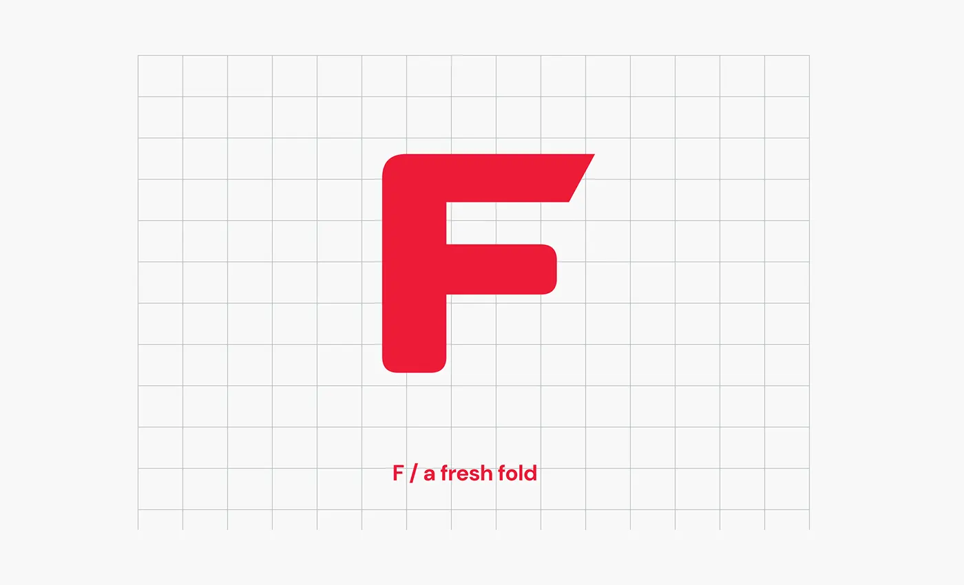
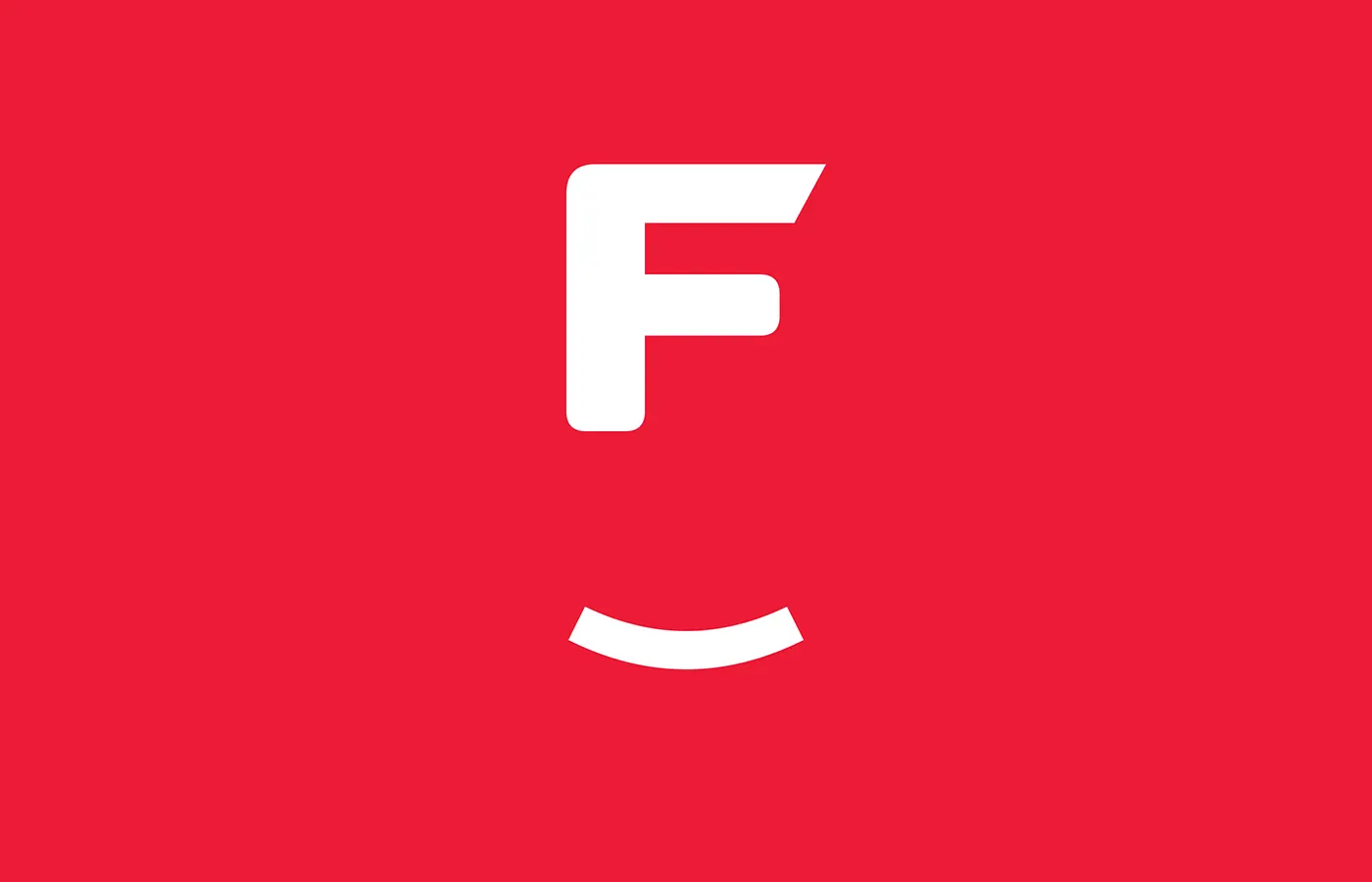
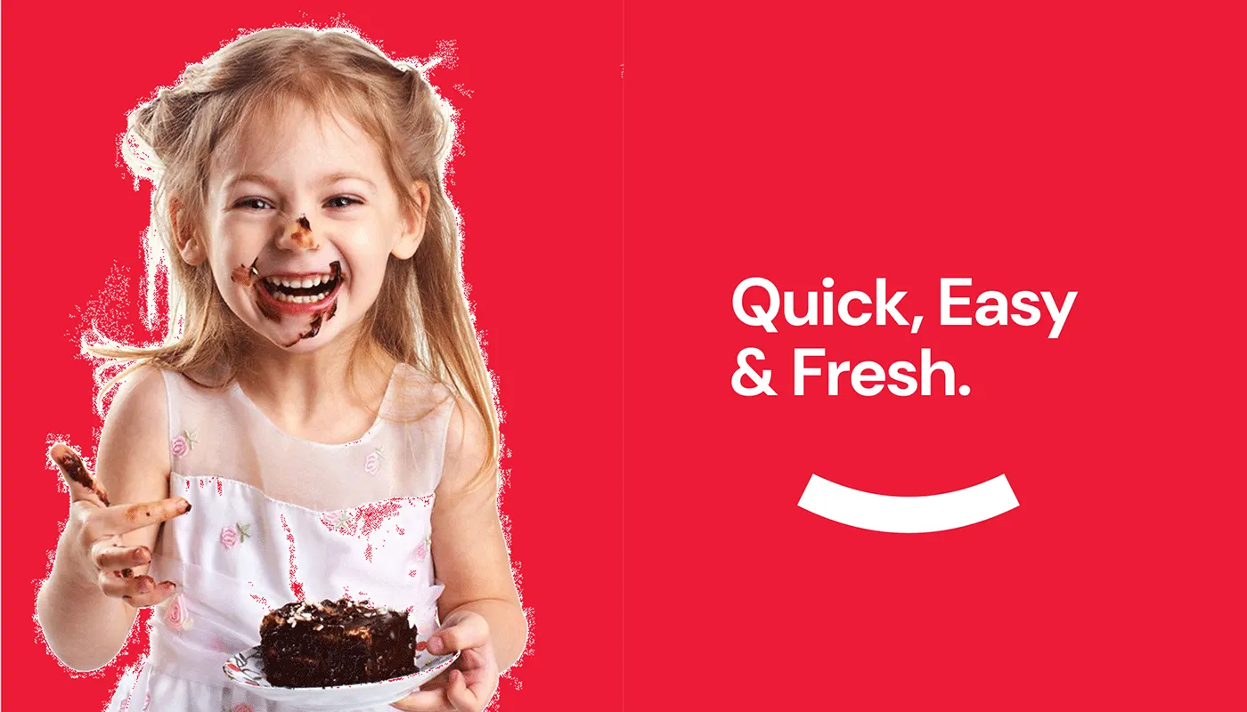
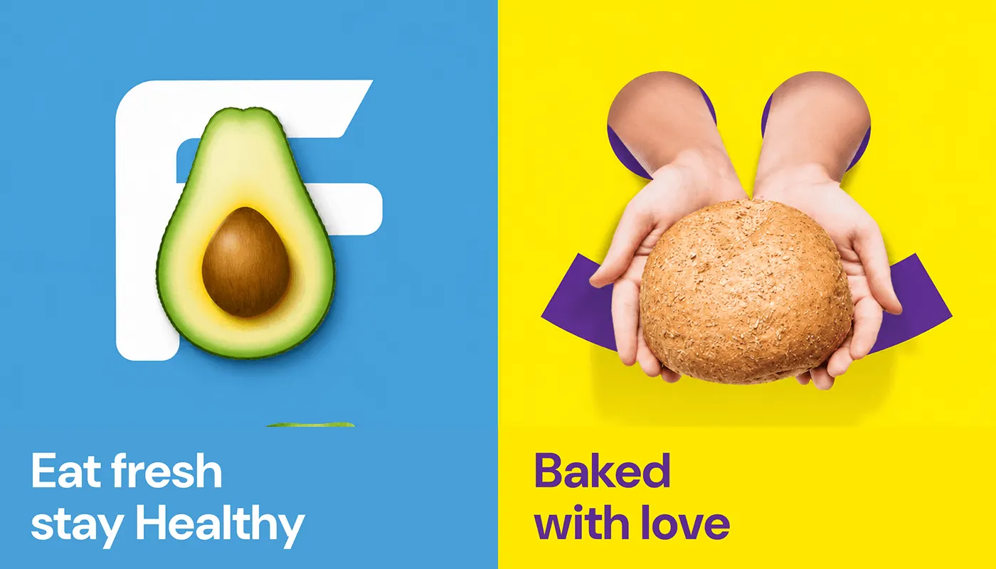
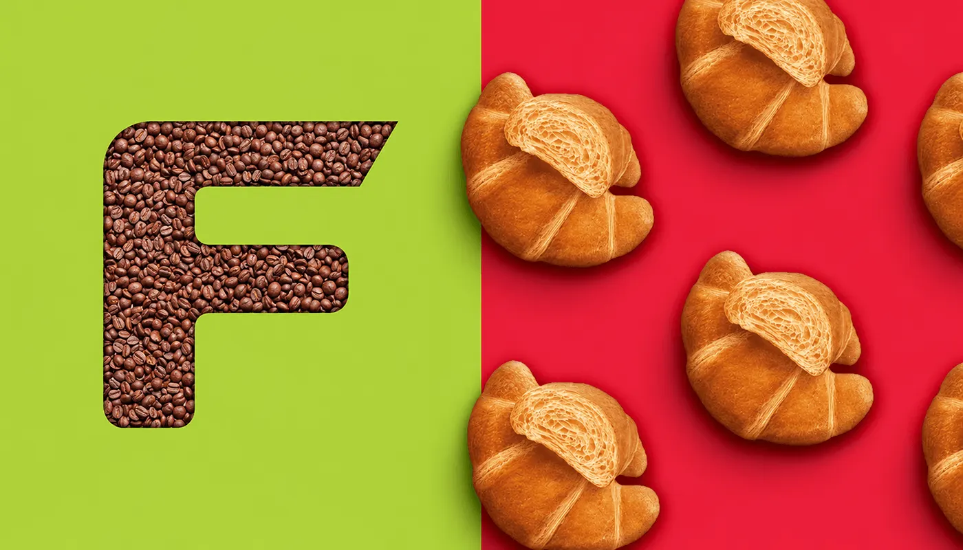
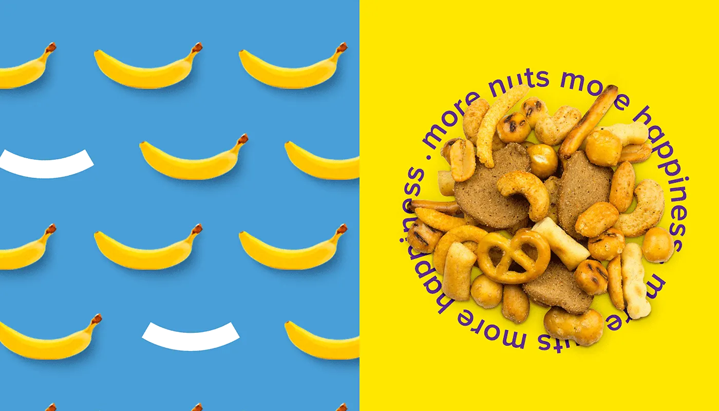
The smile is the starting point: a simple expression of a happy everyday food experience. The F symbol, called "a fresh fold", is drawn on a grid and pairs with a smile line.
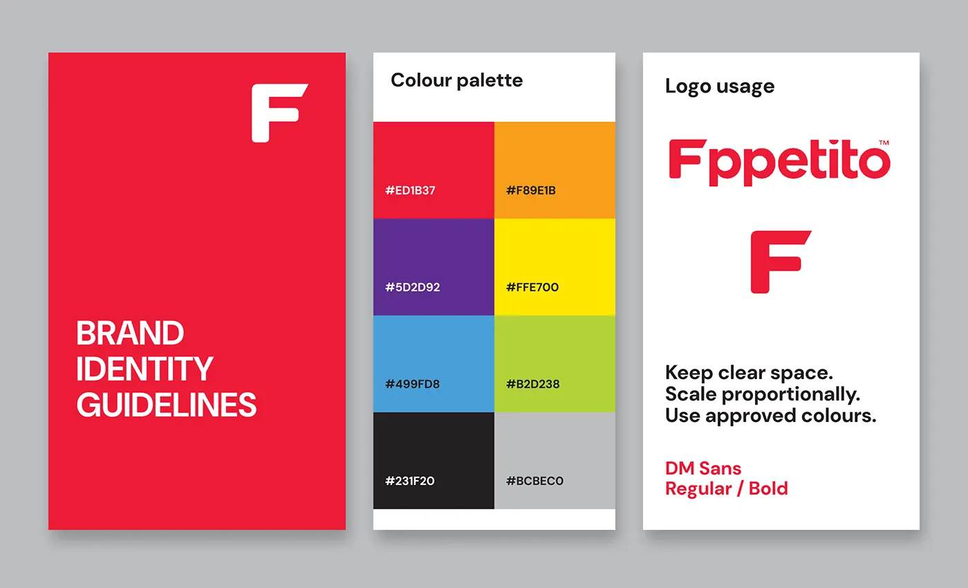
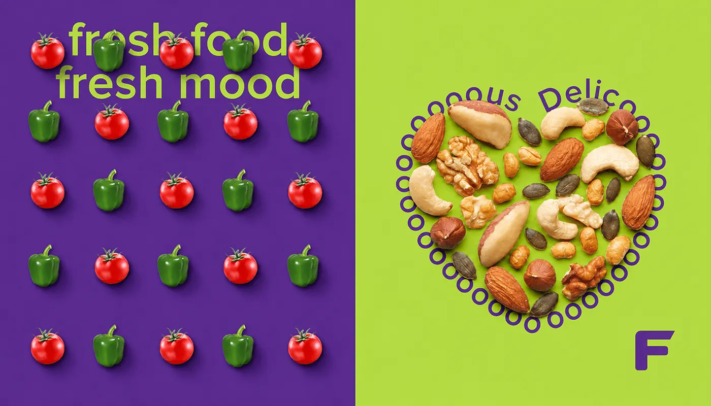
Red #ED1B37 leads the palette, with orange #F89E1B, purple #5D2D92, yellow #FFE700, blue #499FD8, green #B2D238, black #231F20 and grey #BCBEC0. DM Sans in Regular and Bold sets the type.
The result
One brand, from the app to the delivery van.
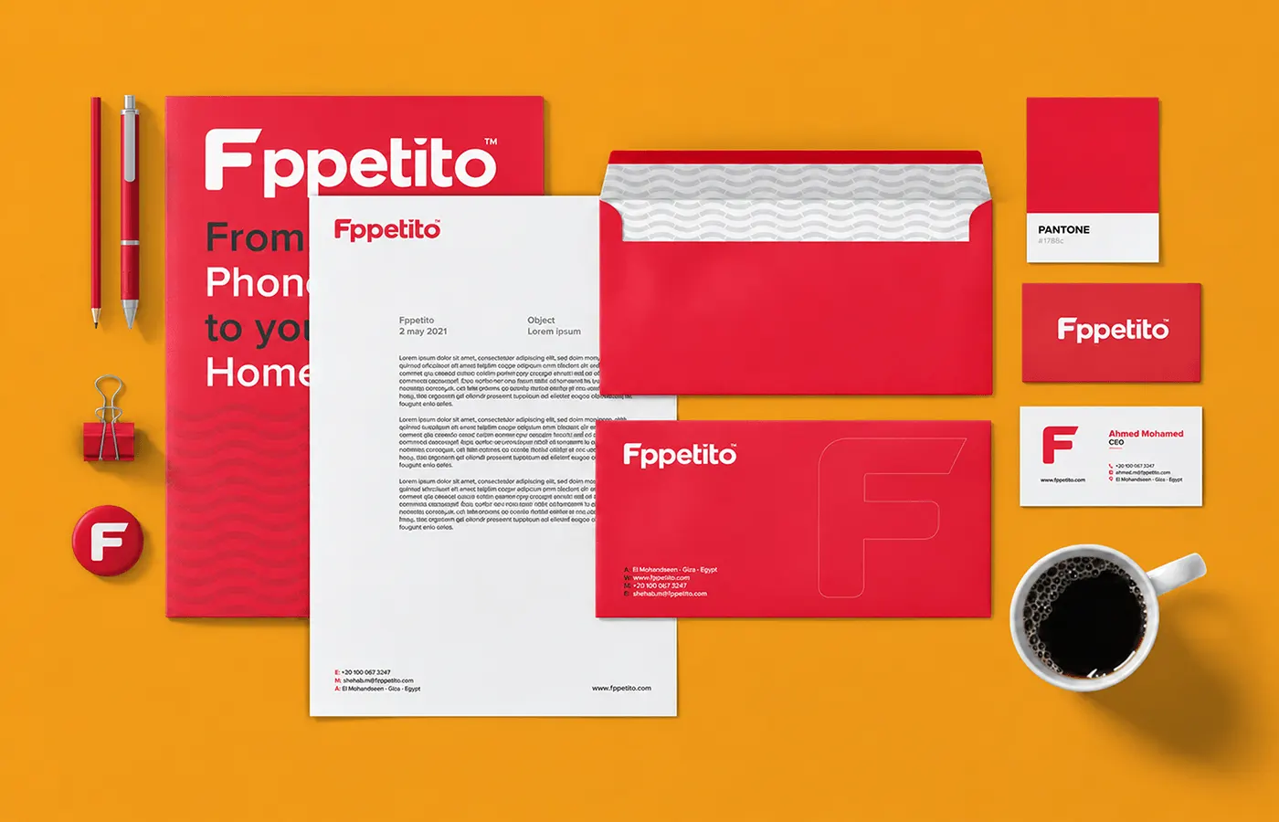
The brand guidelines cover the colour palette and logo usage: keep clear space, scale proportionally and use approved colours.
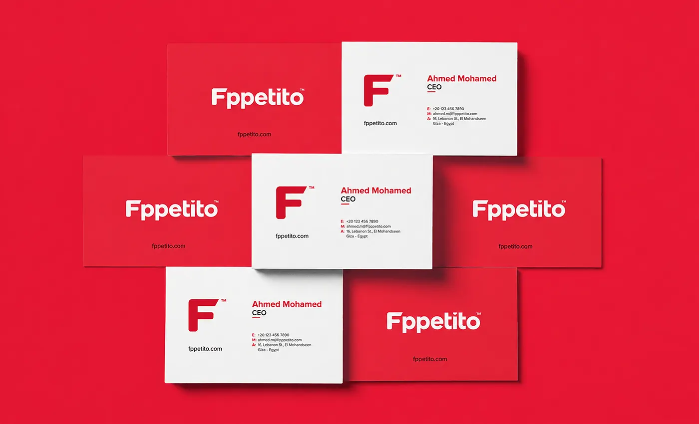
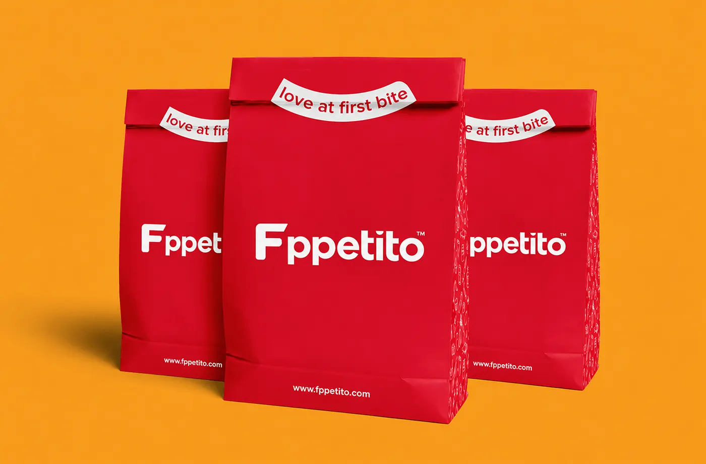
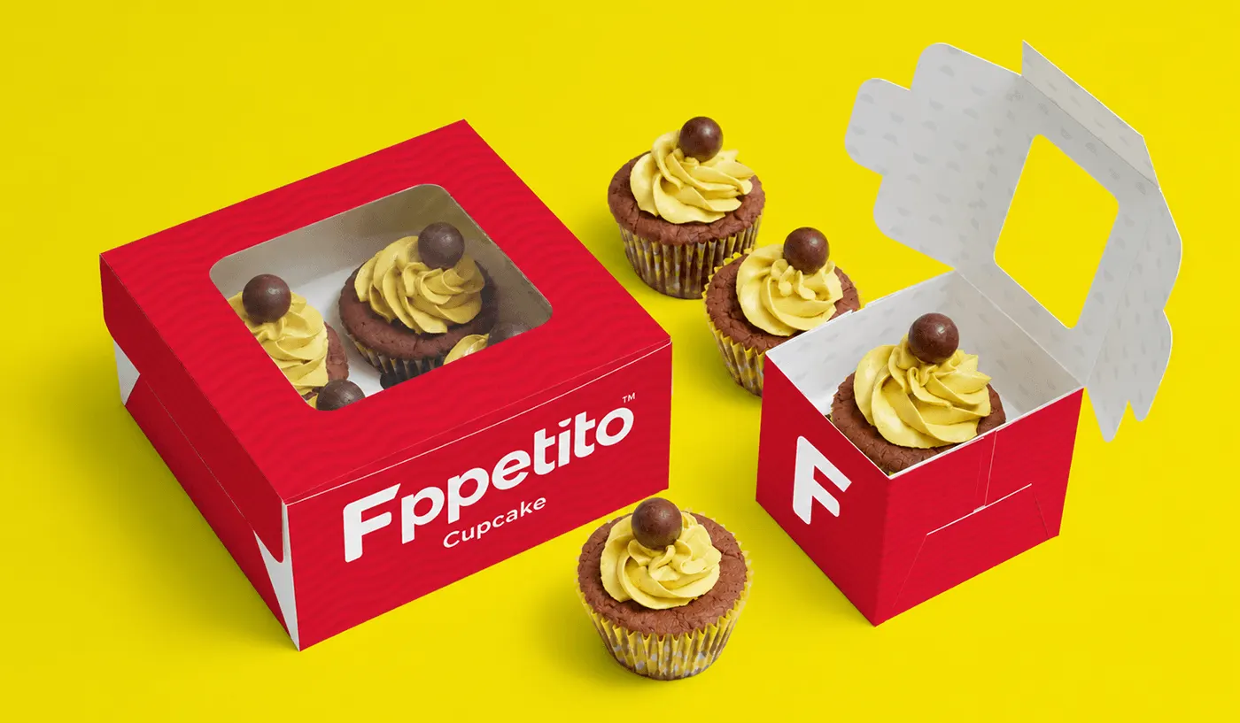
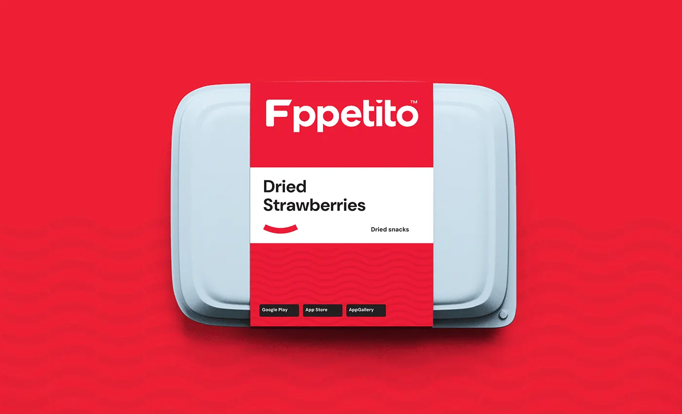
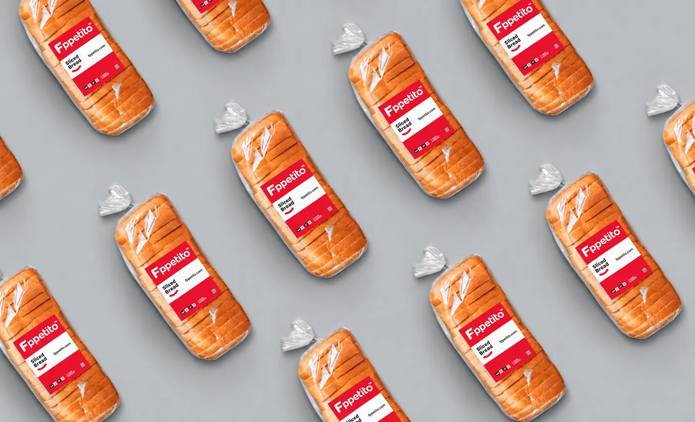
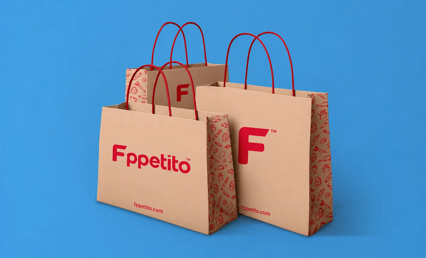
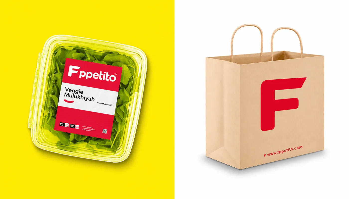
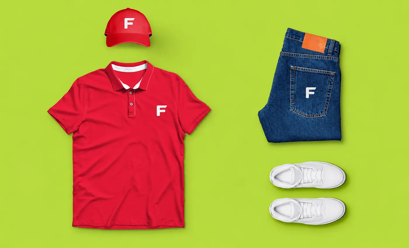
Applications include the app icon and delivery app, business cards and stationery, posts such as "Quick, Easy & Fresh." and "Eat fresh, stay healthy", red delivery bags, cupcake boxes, food packs, kraft shopping bags, a uniform and a delivery van.
What I delivered
Logo design
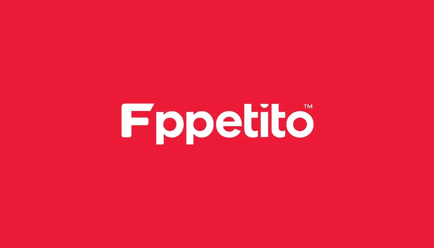
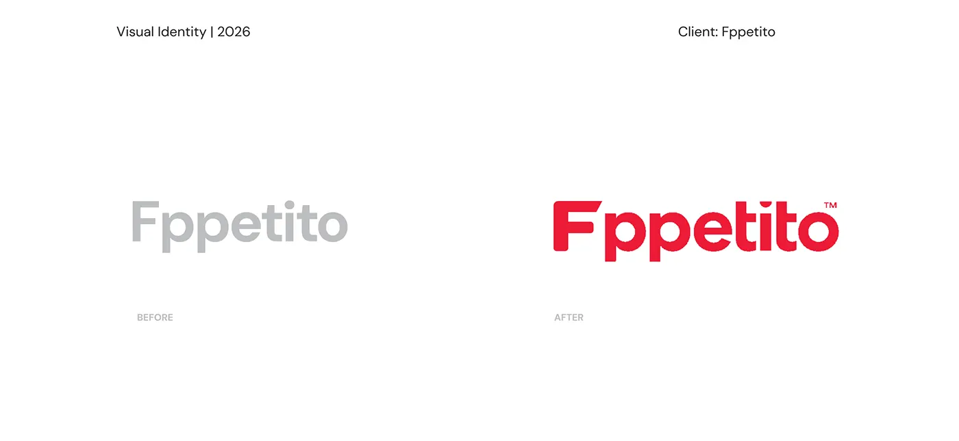
A bold, friendly Fppetito wordmark in red and white.
F symbol and app icon
The F, a fresh fold, with a smile line for the app and small spaces.
Colour and patterns
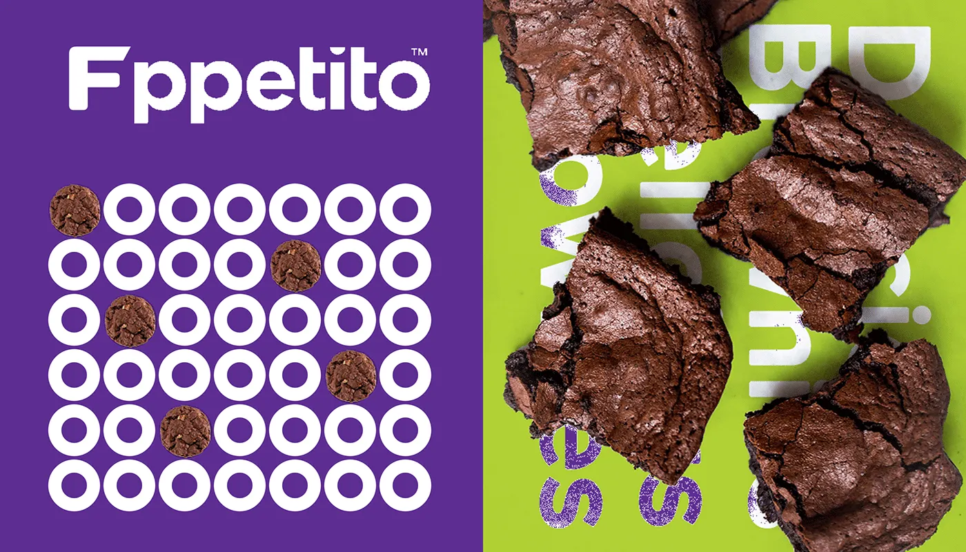
Red led palette with six fresh support colours and simple food patterns.
Packaging
Delivery bags, cupcake boxes, food packs and kraft shopping bags.
Social media and ads
Posts and posters such as Quick, Easy and Fresh and Baked with love.
Brand guidelines
Colour palette, logo usage and DM Sans typography in one document.
Tools and credits
Designed by Jakaria Mahmud, brand identity designer and logo designer.
- Adobe Photoshop
- Adobe Illustrator
- Adobe InDesign
- Figma
The full project, with every board, is also published on Behance.
Restaurant and food branding: what this project shows
Lessons for restaurants, food brands and hospitality businesses.
Fppetito is a food and grocery delivery project by Jakaria Mahmud, a senior brand identity designer working with clients in the USA, UK, Europe and Australia. The work covered wordmark, F symbol, colour palette, typography, patterns, brand guidelines.
Food brands live on menus, bags, cups, boxes, signs and phones. The identity has to make people hungry at a glance, stay readable on small packaging and feel the same in the street, at the table and in a delivery bag.
What other restaurant and food brands can take from it:
- A logo that works on cups, bags, boxes and signage
- Colour and type that stand out on a menu and a crowded social feed
- Packaging, loyalty and print that keep every order on brand
Read the guide to choosing brand colours, see the packaging design service, or how I work with clients in the USA, UK, Australia and Norway.
FAQ
How much does a brand identity like Fppetito cost?
Projects start with the Launch plan at $799 one time, which covers the logo, a brand starter kit and one landing page. A full identity with guidelines, like this food and grocery delivery project, runs on the Partner plan at $1,999 per month. Prices are fixed and public on the pricing page.
How long does a project like this take?
One to two weeks for a logo and starter kit, and three to five weeks for a full identity with guidelines and website.
Do I own the final files?
Yes. Once the project is paid in full, you get every file, the Figma source and full rights to the logo and identity.
Can you design a brand like this for my company?
Yes. I work with founders in the USA, UK, Europe, Australia and worldwide. Book a free 30 minute call and you get a clear plan and a fixed price for your scope.
What should a restaurant or food brand identity include?
A restaurant or food brand identity should include a logo that works on cups, bags and signs, a colour palette and typography that are easy to read on menus and packaging, packaging and takeaway designs, loyalty and print items, social media templates and brand guidelines so every order looks the same.
Who designed the Fppetito brand identity?
Fppetito was designed by Jakaria Mahmud, a senior brand identity designer and logo designer who works with startups and growing businesses in the USA, UK, Europe and Australia. The full project is published on jakaria.design and Behance.
Related topics 17
- Fppetito brand identity
- Fppetito logo design
- Food delivery branding
- Food brand identity
- Logo design
- App icon design
- Food packaging design
- Brand guidelines
- Brand identity
- Restaurant branding
- Restaurant logo design
- Burger brand identity
- Menu design
- Brand identity design
- Senior brand designer
- Brand identity designer USA
- Brand identity designer UK
More brand identity work
View all work Mr. Branky'sBurger brand identity
 Sami CooksMeal prep food brand identity
 CLOGARestaurant and wine bar brand identity
Next step
Start with a free brand audit.
Thirty minutes on what your brand is saying today, what it should say, and the order I would fix it in. You keep the plan whether you hire me or not.